
What goes into a great logo? A successful design solves the problems on the page, but an iconic brand—one that truly stands out—does something more. It’s built to be simple, relevant, and unique. It’s designed to last and, above all, to be impossible to forget.
Keep it simple
In design, the simplest answer is usually the best one. I focus on streamlined solutions because a clean logo isn’t just a style choice—it’s a strategic one. It makes your brand flexible enough to work everywhere, from a tiny favicon to a massive roadside billboard, without losing its impact.
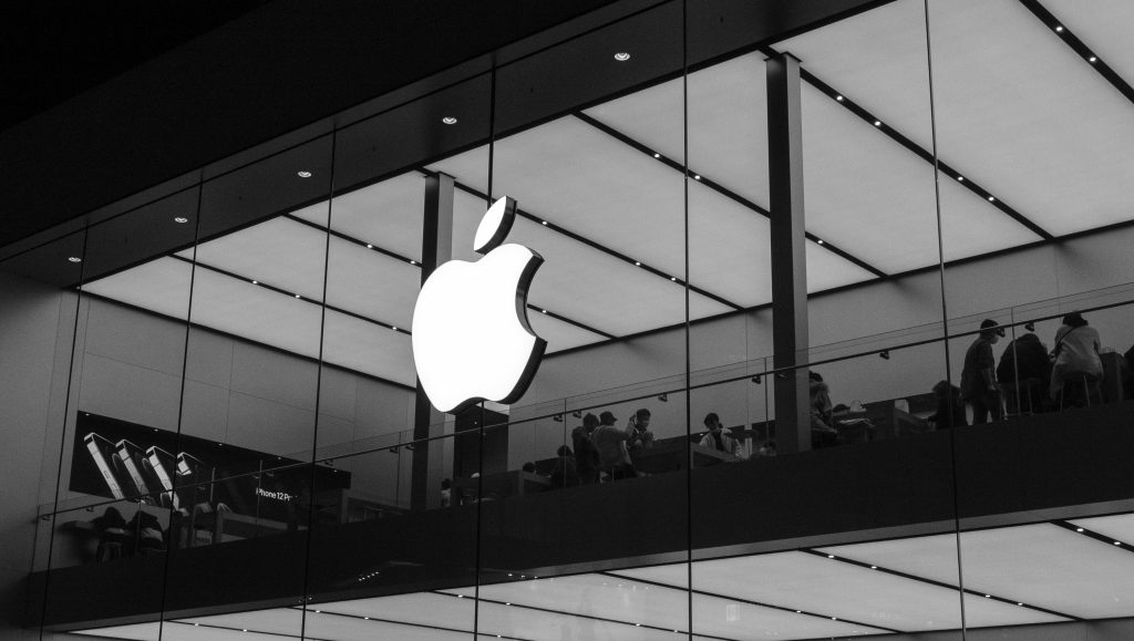
But simplicity is also about being memorable. Icons like Apple or BMW stick in our minds because they don’t overcomplicate things. In a world where you often get only a single glance to make an impression, clarity is everything. That is how you build a brand with the staying power to truly last.
Make it relevant
Design must always be appropriate for the industry and the audience, but it shouldn’t be a literal illustration. A logo’s job is to identify, not to describe. Think of the world’s most iconic brands: Apple isn’t a computer, and BMW doesn’t show a car. These brands succeed because they focus on identity rather than a product description.
Keep in mind that a logo doesn’t need to be a map of your services—in fact, the less it says, the more impact it usually has. By staying perfectly tuned to their markets without over-explaining every detail, these marks prove that a brand is much more than just the product it sells.
Make it distinct.
In a crowded marketplace, being distinct isn’t just a goal—it’s a necessity. A truly successful brand owns its own space, developing a unique character that becomes synonymous with the company it represents. This kind of independence is what ensures a client can never be mistaken for a competitor.
To build that kind of identity, I focus on the ‘memory test.’ I believe a mark should be so well-defined that you could recognize it from its shadow alone. This is why my process always begins in black and white; it strips away the distraction of color to reveal the true strength of the form. When a design can stand on its own in its simplest state, you know you’ve built something with the structural integrity to last for decades.

Need to be memorable
What makes a logo stay with you? Imagine walking through the city and catching a glimpse of a brand for just a moment—that’s usually all the time you get to make a connection. When you think of the most famous logos in the world, what keeps them in your mind? Usually, it’s their simplicity. I’ve found that the more complex a design is, the faster it fades. To be memorable, a mark needs to be bold enough to be recognized in a heartbeat.

Think small
A well-engineered logo should hold its integrity even when scaled down to an inch or less. The only way to achieve that level of performance is through simplicity, which is exactly what gives a brand its longevity. While a billboard offers a massive canvas, the real test is how the design handles the small, essential details—like a social media icon, a zipper pull, or a piece of embroidery.
Keeping things clean and functional is the only way to ensure your brand stays sharp at any size for years to come. Ultimately, a logo that ‘just works’ saves you a significant amount of money on printing, uniforms, and implementation costs because you aren’t constantly trying to fix a design that doesn’t fit the real world.
Recuerde el contexto
Mientras que una marca se crea de forma aislada, ya sea mediante un boceto/dibujo o directamente en un documento en blanco de Adobe Illustrator, la aplicación final tendrá un entorno muy diferente. En palabras de Paul Rand, «Un logotipo deriva su significado de la calidad de lo que simboliza, y no al revés». Si estudiamos detenidamente las aplicaciones pertinentes (dónde, para qué y cómo se utilizará) y nos centramos en una sola característica que haga la diferencia, conseguiremos que nuestro diseño tenga todas las posibilidades de convertirse en un ícono.
CRÉDITOS DE IMÁGENES:
LOGO APPLE , POR ROB JANOFF, FOTO POR BANGYU WANG
FEDEX LOGO, POR LINDON LEADER, FOTO POR DANO
BMW LOGO, FOTO POR VICTOR CONSTANTINOVIC
MC DONALD’S LOGO, POR JIM SCHINDLER, FOTO POR JANET GANBOLD
SOZO LOGO EN GAVETES, FOTO POR UKP GARMENT BRANDING AND PACKAGING