


La Naturaleza Sabe Más | Crafting an Authentic, Conscious Skincare Brand
Brand Strategy, Logo Design, Visual Identity, Print Media, Web Design
La Naturaleza Sabe Más (Nature Knows Best) is a dedicated artisanal brand producing natural, handmade soaps crafted solely from 100% organic and sustainable ingredients. This project encompassed the complete creation of the brand from its name and strategic positioning to its visual identity and tangible applications.
My Role: Brand Strategy, Naming, Visual Identity Design, Packaging Design, Web Design, Creative Direction.
The client needed a comprehensive brand solution for a product centered on ethical purity and artisan craftsmanship. The primary challenges included:
• Developing a compelling name that resonated with health-conscious consumers.
• Clearly distinguishing the products from commercial, mass-produced alternatives.
• Building a sense of deep trust that would overcome consumer skepticism about “natural” claims and drive purchases.
• Ensuring all designs, especially packaging, were sustainable, cost-effective, and easy to produce by hand.
• Structuring a multi-faceted presence, including an educational workshop component and an e-commerce platform.
The creative strategy was built on the core belief that “nature knows best”—authenticity must be palpable in every element.
• The Naming Strategy: La Naturaleza Sabe Más was chosen as it is an immediate, declarative statement of the brand’s philosophy. It conveys wisdom, simplicity, and a direct connection to the efficacy of natural ingredients, building trust from the very first interaction.
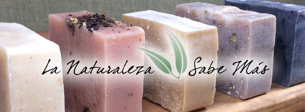
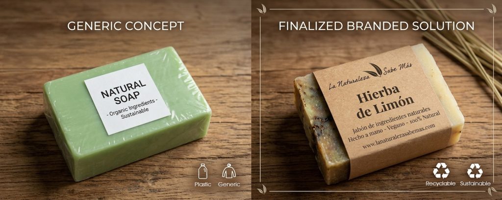
• The Aesthetic Focus: The visual identity had to be stripped of all corporate sterility. The focus was on creating a look that felt created, not manufactured, ensuring customers immediately perceived the artisanal value.
• Trust and Education: Trust was earned not only through the product quality but also through transparency. The inclusion of educational workshops and a detailed website empowered consumers with knowledge, further solidifying the brand’s commitment to authentic natural wellness.
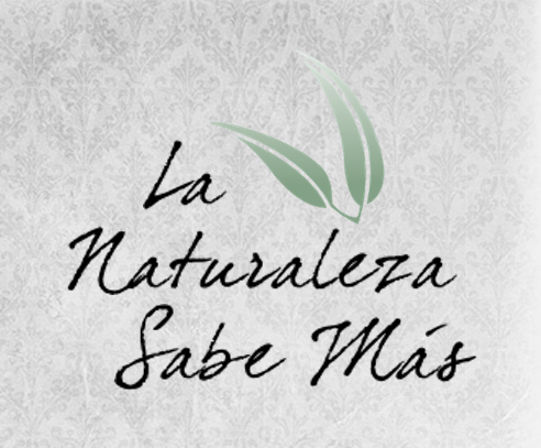
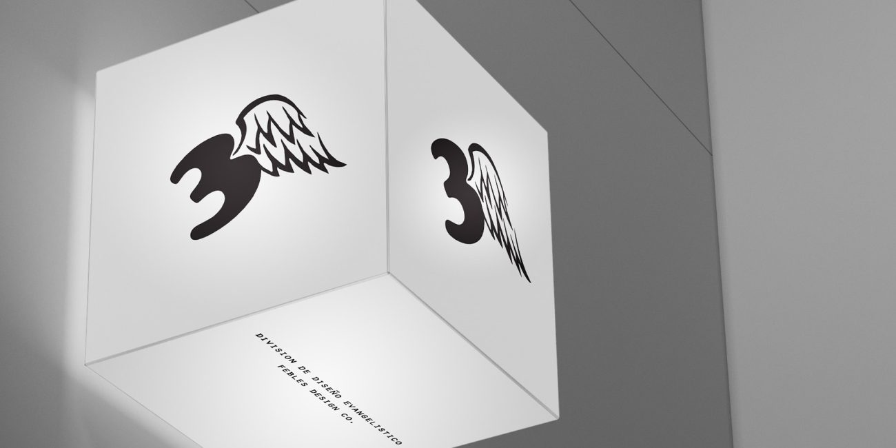
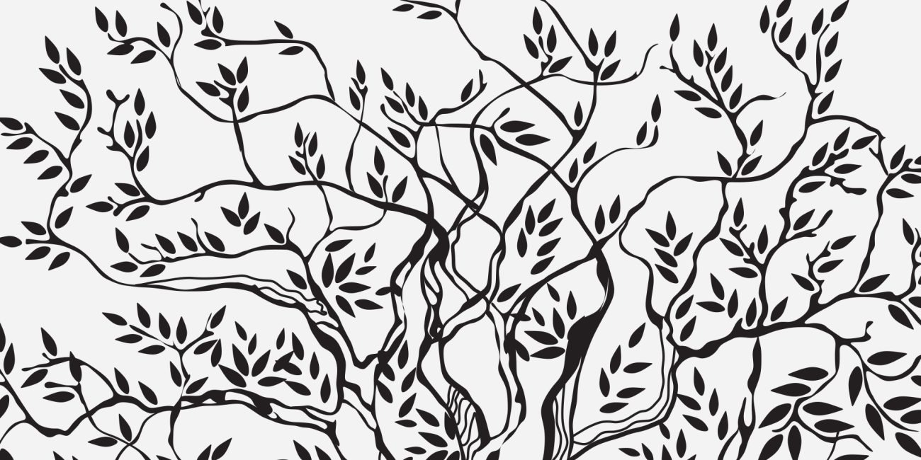
Logotype Design: Organic, Delicate, Feminine
The logo was engineered to synthesize three core concepts. The typography is clean yet possesses a soft, hand-tailored feel, avoiding rigid, corporate lines. The iconography (if applicable, or the letterforms themselves) embodies organic delicacy and a subtle, welcoming feminine strength, reflecting the gentle, nurturing qualities of the skincare products.
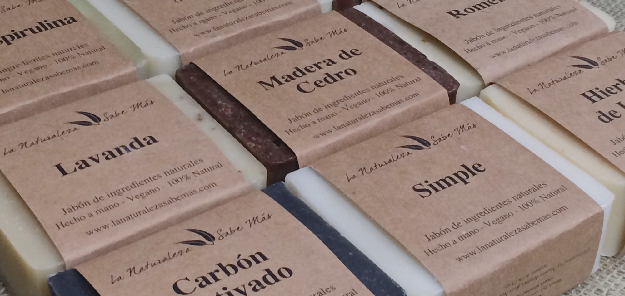
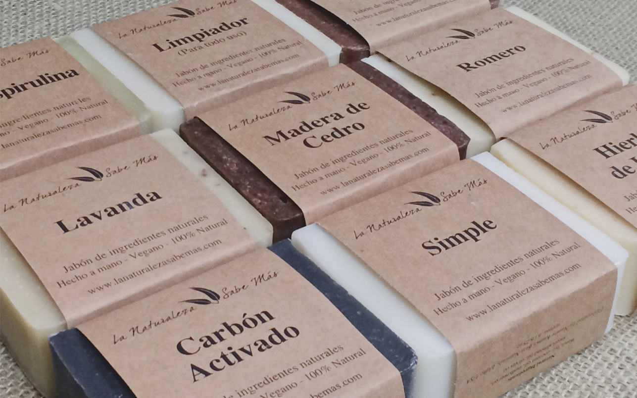
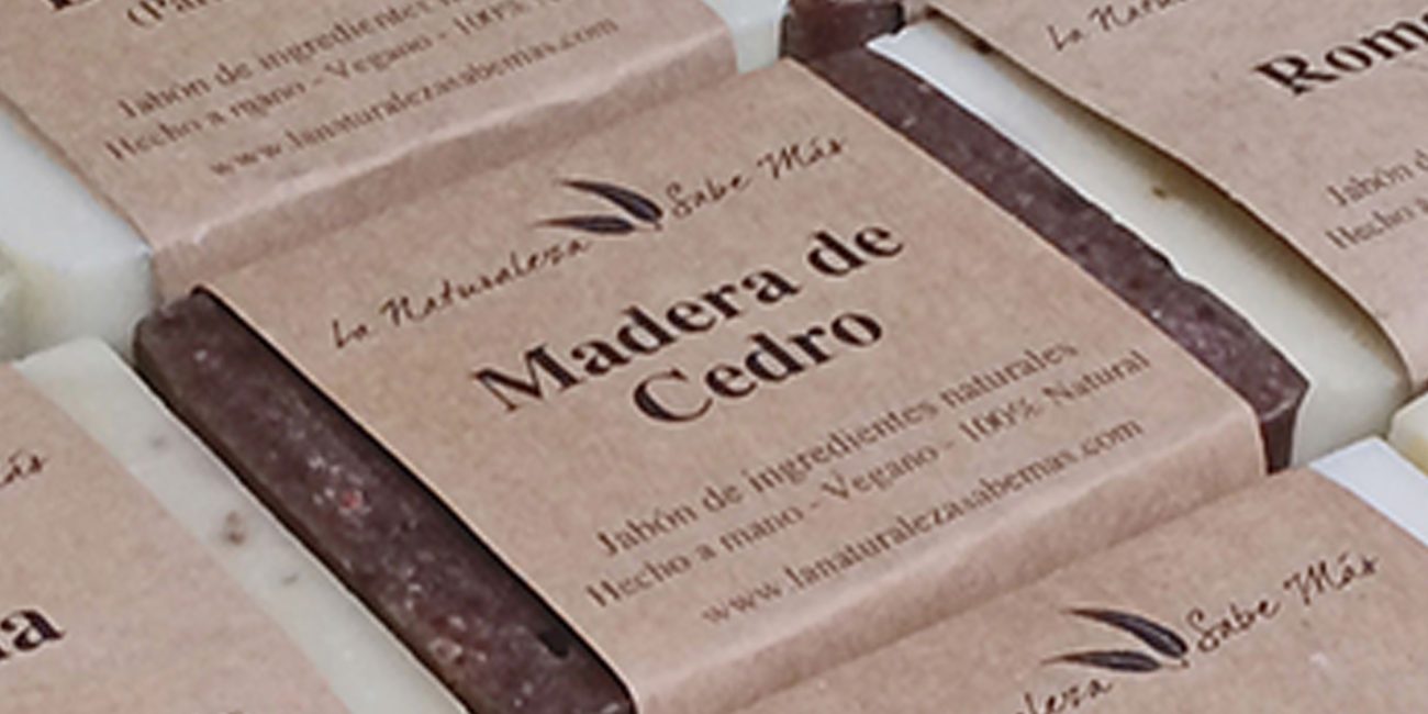
Eco-Conscious Packaging Design
The packaging was a critical touchpoint. It was designed to maximize sustainability while minimizing production complexity and cost:
• Materials: Utilization of recycled or biodegradable materials was non-negotiable, reinforcing the brand promise.
• Design: The layout is minimalist and clear, using tactile finishes that emphasize the product’s handmade origin.
• Efficiency: Crucially, the packaging system was designed to be simple for the artisan to assemble by hand, keeping production costs scalable.
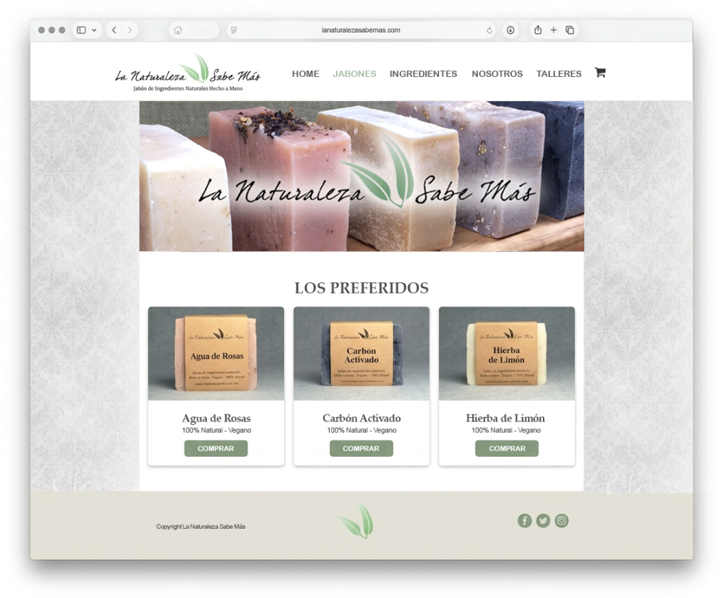
Digital & Physical Presence
• E-Commerce Website: The digital store was developed as an extension of the brand’s organic aesthetic. It offers a seamless, trusted shopping experience that emphasizes ingredient transparency and product storytelling.
• Workshop Identity: A consistent sub-brand was created for the educational workshops, leveraging the same organic principles and ensuring a cohesive brand experience across all touchpoints.
• Successful Brand Launch: Delivered a complete, coherent brand that accurately reflects its artisanal, ethical, and organic mission.
• Direct-to-Consumer Growth: Established a functional and beautiful e-commerce platform that successfully converts trust into sales.
• Community Engagement: Provided a unified identity for workshops, fostering a community around sustainable skincare.
• Efficient Operations: Created a packaging solution that is both highly marketable and highly practical for small-scale production.
• Full Brand Naming & Strategy
• Comprehensive Logo & Visual System
• Eco-Sustainable Packaging Solutions
• Responsive E-Commerce Website
• Workshop Identity & Graphics
Selected Projects
