
Ultimate Purpose | Designing for Growth and Higher Intent
Brand Strategy, Logo Design, Visual Identity, Print Media
Ultimate Purpose OutdoorsCare is a specialized landscaping and gardening firm dedicated to the design and maintenance of premium indoor and outdoor green spaces. Beyond traditional lawn care, the company is driven by a passion for excellence and a commitment to making a tangible difference in the market. I was tasked with creating a sophisticated visual identity that could encapsulate this “ultimate purpose” through a strong, modern brand.
My Role: Brand Strategy, Identity Design, Messaging Architecture, and Apparel Design.
The brand needed to communicate two distinct but overlapping philosophies:
1. The Spiritual Foundation: Reflecting the owners’ Christian values, the identity needed to symbolize a commitment to seeking a higher will by “always looking upward.”
2. The Higher Standard (Work as Worship): In alignment with the owners’ convictions, the company operates under the biblical principle found in Colossians 3:23: “Whatever you do, work at it with all your heart, as working for the Lord, not for human masters.” This mandate transforms “standard maintenance” into a higher calling of excellence. The visual identity reflects this by communicating a level of sophistication and precision that goes beyond industry norms. Every design choice—from the refined typography to the architectural lines of the monogram—serves to signal that the work is performed with the utmost integrity, as if each project were a direct offering to God. This dedication to “Ultimate Purpose” naturally differentiates the company, as their standard of quality is driven by an eternal accountability rather than just market competition.
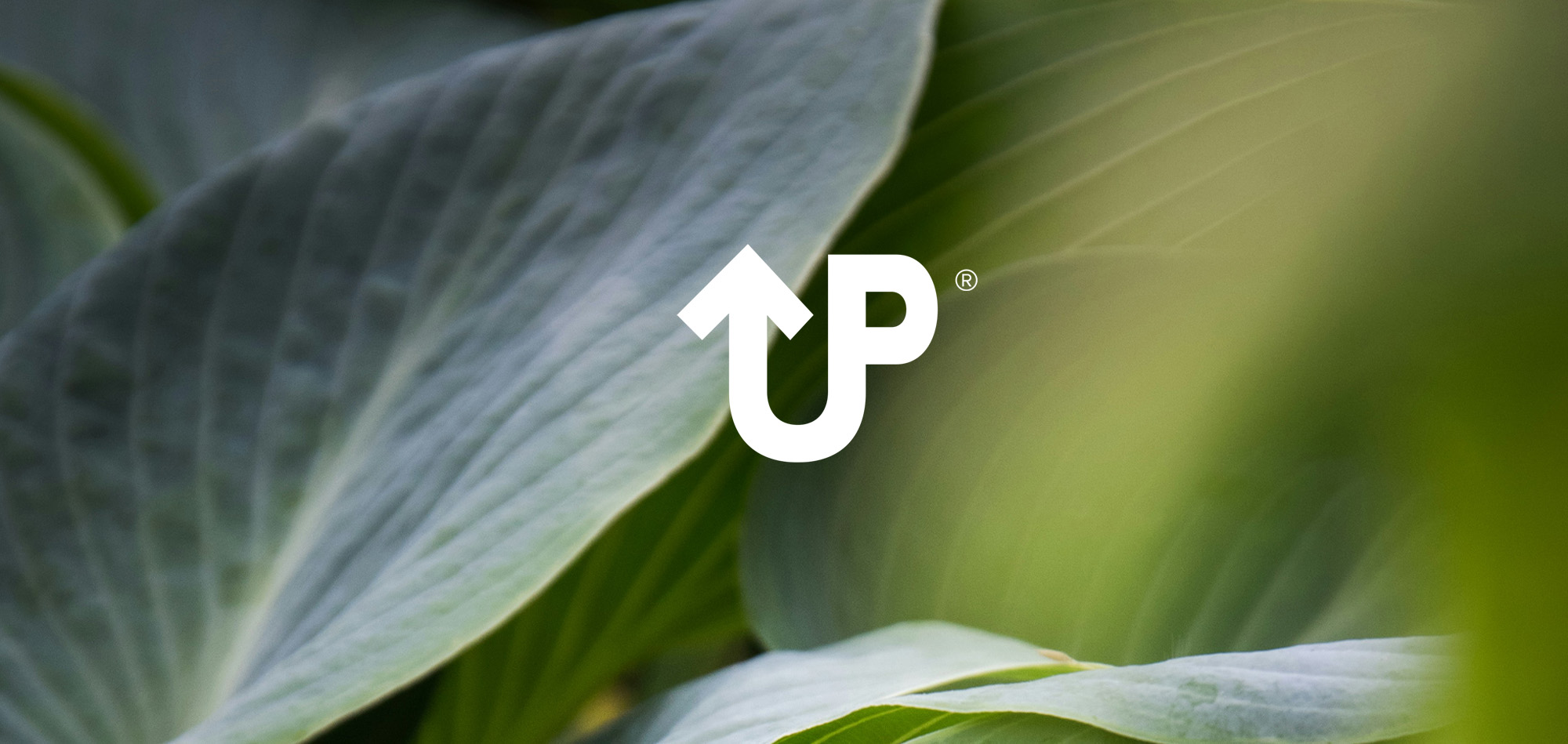
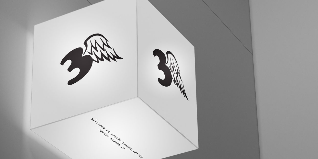
The strategic solution was found within the initials of the company name: Ultimate Purpose. By combining these letters, I developed a “directional” logo that functions as a visual shorthand for the brand’s name and its spiritual mission.
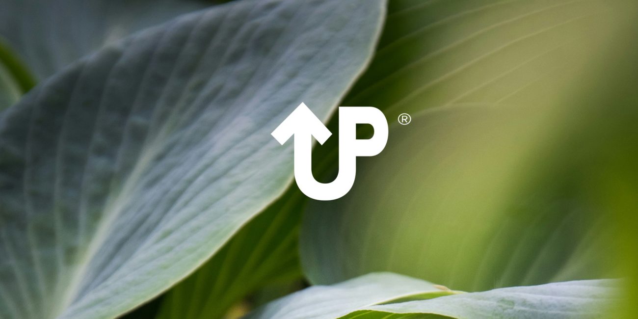
• The Arrow Metaphor: The strategic core of the identity is the unique typographic fusion of the letters U and P. Rather than sitting side-by-side, the characters combine into a single, cohesive mark where the anatomy of the letters transforms into a sharp, upward-pointing arrow. This structural integration serves as a literal representation of the word “UP” while symbolizing the company’s foundational commitment to higher standards and looking toward God. By evolving the letterforms into a directional icon, the brand communicates that its mission and its service are inseparable.
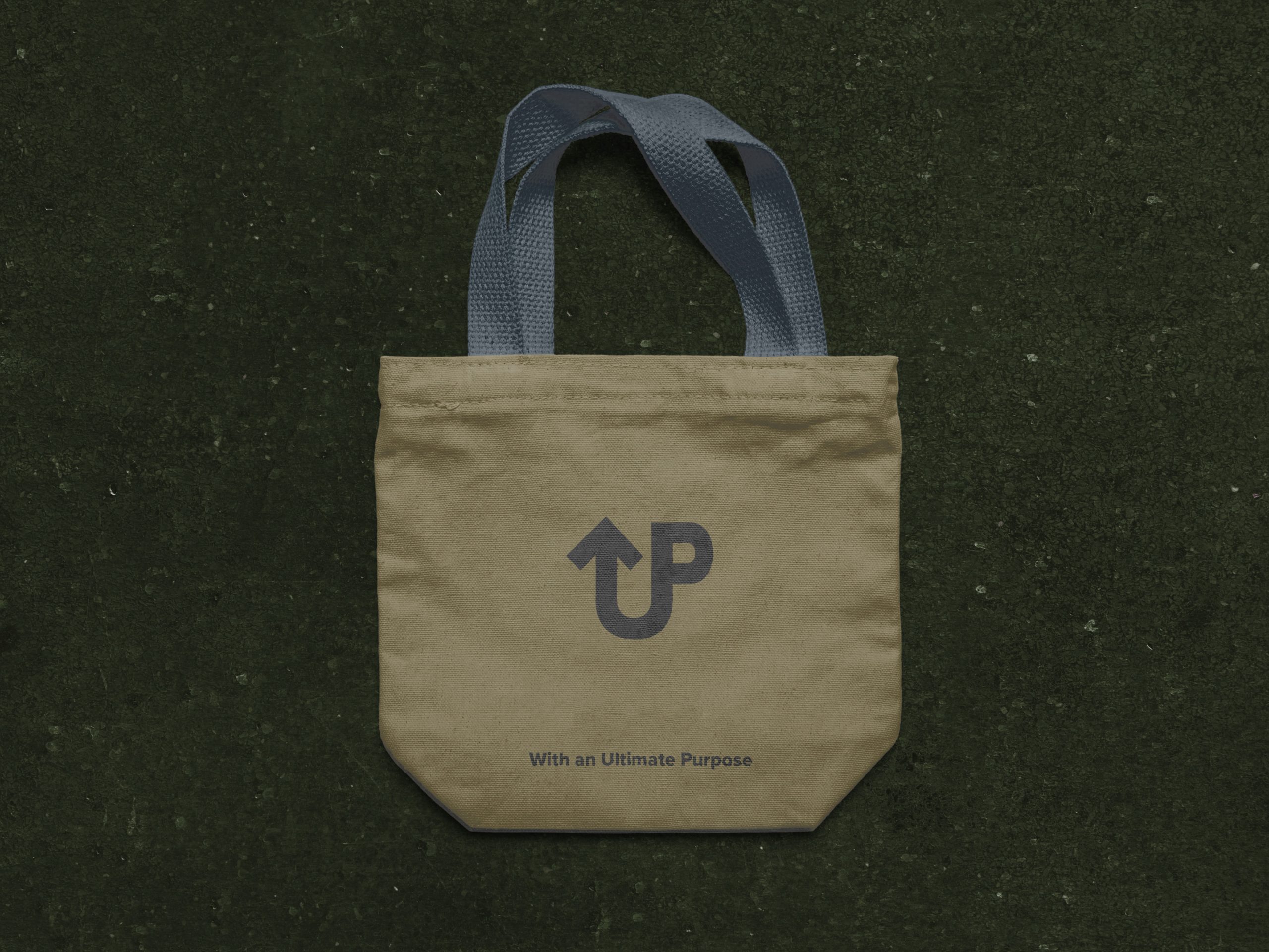
• The “Ultimate” Tagline: To solidify the brand’s second meaning—making a difference in every project—I established a strategic messaging rule. Every tagline or motto used in advertising must conclude with the anchor phrase: “…with an Ultimate Purpose.”
The Visual Identity System
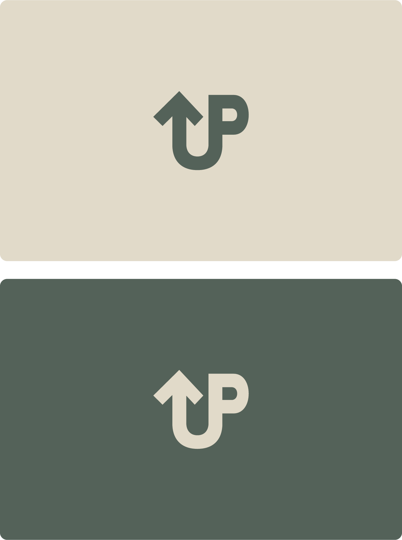
The logo is designed with architectural precision, utilizing a palette of Forest Green, Slate Grey, and Earthy Tones. This color story anchors the brand in nature while maintaining a “premium” feel.
• Symbolic Versatility: The “UP Arrow” icon is designed to stand alone as a high-end monogram for luxury properties, or work alongside the full wordmark for broader market recognition.
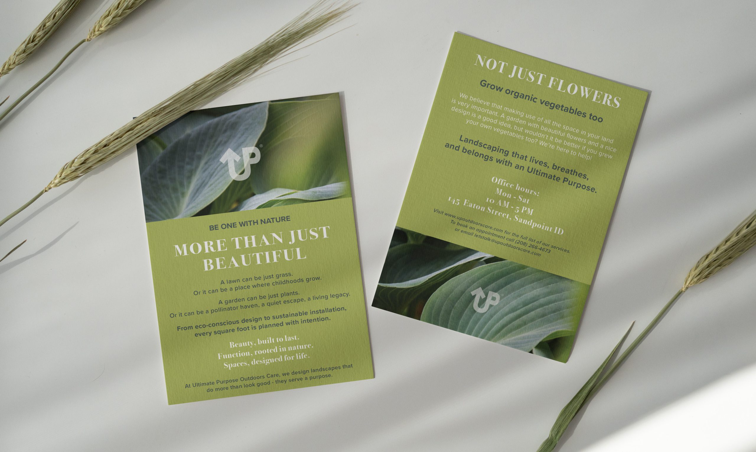
High-End Collateral & Professional Touchpoints
• Business Stationery: The business cards utilize a clean, minimalist layout with the “UP” monogram as a focal point, signaling professional organization and strategic intent.
• Marketing Materials: Promotional flyers and digital ads integrate the “Ultimate Purpose” phraseology, ensuring that the brand’s “why” is as visible as its “what.”
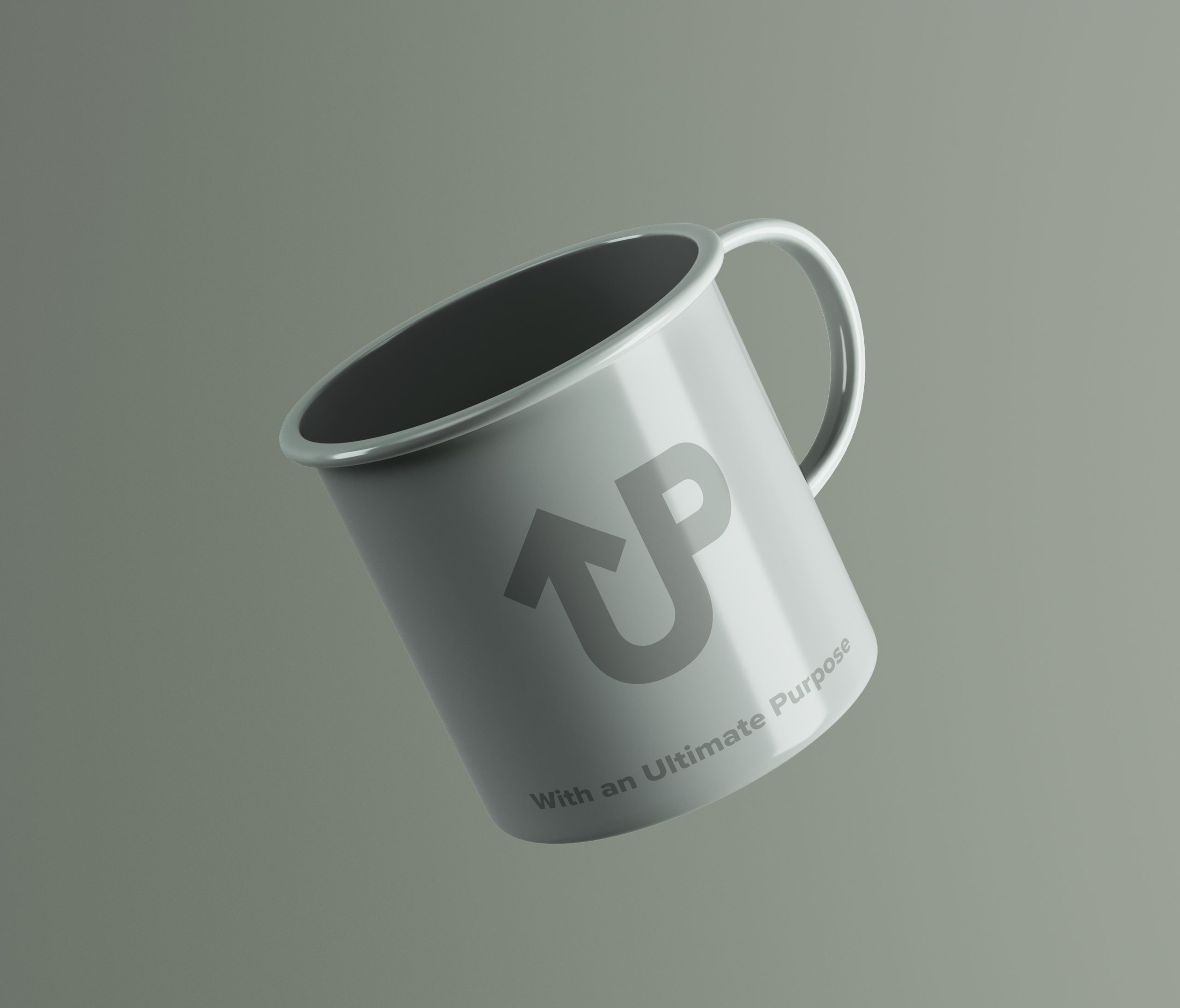
Apparel & Lifestyle Branding
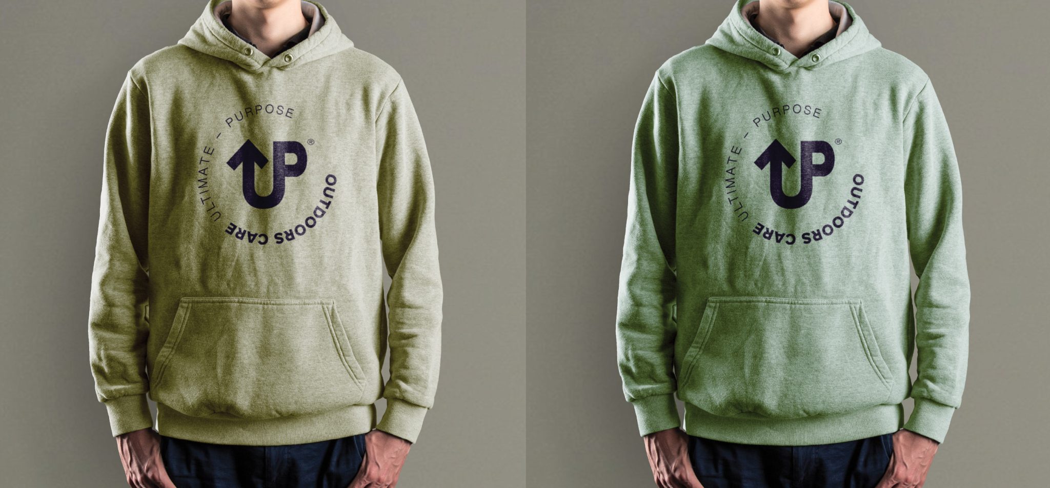
• Workwear Strategy: Because landscaping is a visible, physical service, I focused on high-quality apparel. The monogram was applied to enamel mugs, bucket hats, and premium hoodies.
• Impact: By using the “UP” icon on lifestyle items like reusable bags, the brand transitions from a service provider to a lifestyle choice associated with quality and purpose.
• Conceptual Depth: Successfully integrated a deeply personal spiritual message into a professional corporate identity without sacrificing market appeal.
• Distinct Market Positioning: The sophisticated typography and icon system repositioned the company as an “OutdoorsCare” specialist rather than just a gardening service.
• Unified Brand Voice: The “Ultimate Purpose” messaging framework provides a consistent, memorable conclusion to every brand interaction, reinforcing customer loyalty and brand intent.
• Conceptual Monogram & Directional Icon (“UP Arrow”)
• Comprehensive Brand Identity & Color System
• Integrated Tagline & Messaging Framework
• Premium Corporate Apparel & Lifestyle Merchandise Design
Selected Projects
