


Life Tree | Conceptual Explorations in Brand Identity
Logo Design
Life Tree is a versatile Christian organization focused on organising large-scale events, seminars, conferences, and missionary work. Beyond these events, they provide tailored “Creative Solutions” to churches to help them optimize their internal operations and externally promote their ministries. I was tasked with developing three completely different visual concepts under the Life Tree name, each exploring a unique philosophical pillar of their mission.
My Role: Brand Strategy, Multi-Concept Development, Identity Design, Art Direction.
The “Life Tree” name is rich with scriptural meaning, but it needed to represent an organization that wears many hats—from professional consulting and event production to historical reverence and future innovation. The challenge was to move beyond a singular “safe” concept and instead explore three separate brand personalities that could coexist under the Life Tree umbrella. Each proposal had to be a completely different strategic solution.
I developed three distinct directions, each built around a core theme found in the organization’s mission, ensuring that any final choice would feel authentic:
Concept 1: Rooted in Revelation (Traditional & Authority) – Focusing on historical reverence, Biblical text, and divine sovereignty.
Concept 2: Dynamic Growth (Event-Driven & Missionary Work) – Aimed at large-scale conferences, movement, and transformative “Life.”
Concept 3: The DNA of the Gospel (Innovative & Structural Support) – Positioning the organization as a modern, innovative partner for church success.
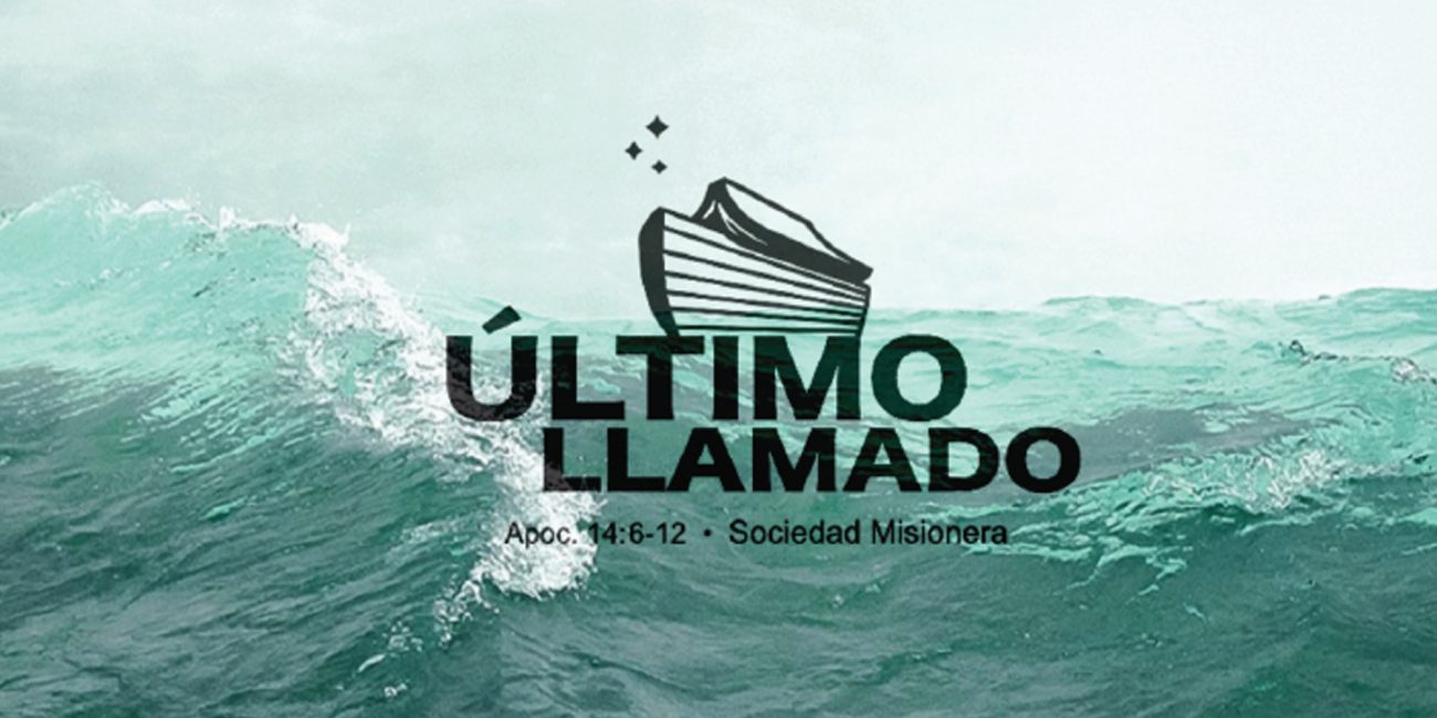
Direction 1: Rooted in Authority (traditional & reverence)
• Core Theme: Sovereign Foundation & Biblical Authority.
• Visual Strategy: This concept utilizes a highly detailed, classical illustration of an established tree, paired with an elegant wordmark. The central identifier is the inclusion of a formal Crown, visually reinforcing divine sovereignty.
• Application: Crucially, this concept integrates the full scripture (Revelation 22:14) into its circular mark and environmental layouts. This direction was designed for a Ministry-Focused application, ideal for missionary reports, theological seminars, and traditional church partnership initiatives where trust and historical authority are paramount.
Direction 2: The Modern Framework (Structural & Balanced)
• Core Theme: This direction represents Life Tree as a foundation for growth. Instead of a traditional, literal tree, it uses a minimalist, stylized mark to signify stability, professional structure, and the organized nature of large-scale events and missionary operations.
• Visual Strategy: The icon features a perfectly symmetrical canopy of leaves rising from a strong, central base. The use of thick, uniform lines and a modern, bold sans-serif typeface communicates clarity and efficiency. The central identifier is the inclusion of a formal Crown, visually reinforcing divine sovereignty.
• Application: This branding was developed for the “Creative Solutions” and consultancy branch of the organization. It positions Life Tree as a professional partner capable of providing the structural support and visual systems needed for modern church management and international conferences.
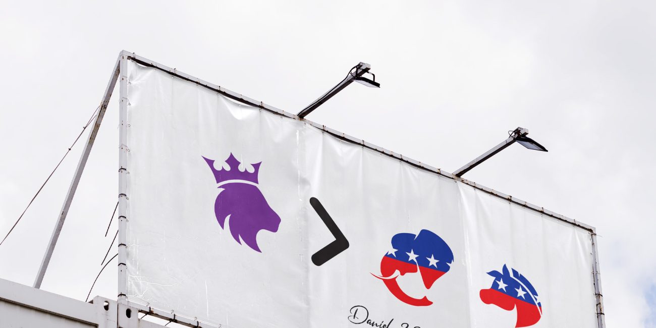
Direction 3: The DNA Bridge (innovative & structural support)
• Core Theme: Engineering the Future of Church Success.
• Visual Strategy: The most innovative direction. It uses geometric clarity to create a “Visual Analogy”: a minimalist set of leaves that seamlessly merge with a DNA double helix structure serving as the tree’s trunk.
• Application: This concept reframes “Life” as the strategic “DNA” of the Gospel and a church’s internal operations. It targets the “Creative Solutions” and church consulting side of the business, positioning Life Tree as a modern, high-tech partner for churches seeking professional optimization and innovative strategies.
• Conceptual Clarity: By presenting three distinct visual metaphors side-by-side, the client was able to instantly see how their public persona would shift between “Authority,” “Mission Outreach,” and “Innovation.”
• Multi-Faceted Relevance: Each direction was shown in action (from printed text layouts to digital mockups), proving that the organization could utilize a specific identity for a specific initiative (e.g., using the “Crown” concept for a mission and the “DNA” concept for church strategy consulting).
• Streamlined Selection: This exploration allowed Life Tree to select the identity that best matched their primary focus while understanding how their overall brand ecosystem could behave.
• Symbolic Multi-Concept Identity Suite
• Conceptual Strategy & Theme Development
Selected Projects
