


Imagination | Designing the Equation for Endless Creativity: The Geometry of Discovery
Brand Strategy, Logo Design, Visual Identity, Ad Campaign, Print Media
Imagination is not just a standard retail store; it is a conceptual space where practicality intersects with inspiration. The core philosophy is that a routine trip to the store can spark a moment of creative discovery—a place where a customer might enter for a simple utility item and leave with a creative breakthrough. I was tasked with developing a complete brand ecosystem—including the store name, a dynamic logo, and a cohesive multi-channel marketing campaign—all centered on the idea that “creativity combines, and adds up endlessly”.
My Role: Brand Naming, Strategy, Identity Design, Art Direction, Ad Campaign Development, Environmental Design.
The goal was to create a name and identity that felt like a puzzle waiting to be solved. It needed to embody the store’s philosophy: “Where your creativity combines with ours, and you’ll find endless ideas.” The brand couldn’t just look like a store; it had to look like the process of imagining.
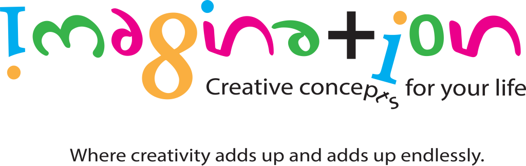
I developed a unique naming and visual strategy by treating the word Imagination as a mathematical result. By assigning numeric values to represent letterforms, I created a metaphorical equation for the brand:
1368156 + 105 = Imagination
• The “Plus” Factor: In this system, the plus sign (+) is not just a mathematical operator; it serves as a visual substitute for the letter “t” within the wordmark.
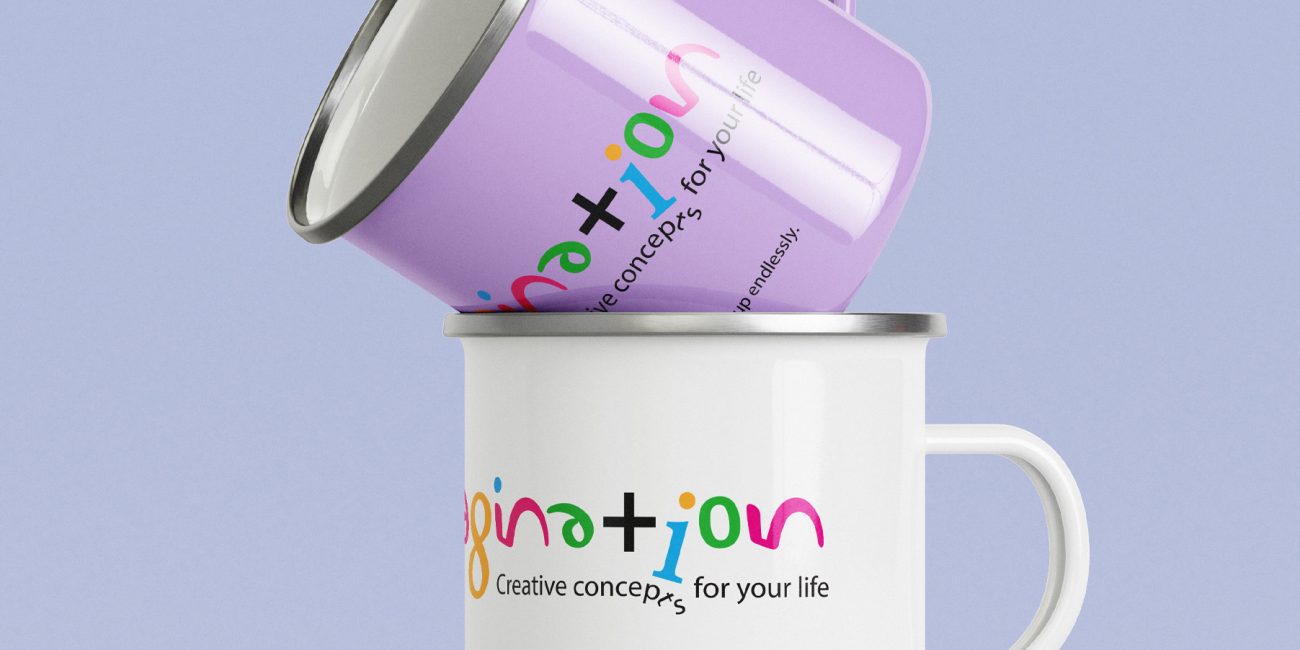
• The Result: This equation reinforces the brand promise: Where creativity adds up and adds up endlessly. It tells the customer that their input plus the store’s resources equals a limitless outcome.
The “Coded” Wordmark
The logo is a typographic masterclass in hidden meanings. By integrating the numbers 1, 3, 6, 8, 1, 5, 6 and 1, 0, 5 into the structure of the letterforms, the logo becomes a piece of “Visual Intelligence.” The (+) sign acts as the structural anchor for the word, representing the letter “t” and the act of addition simultaneously.
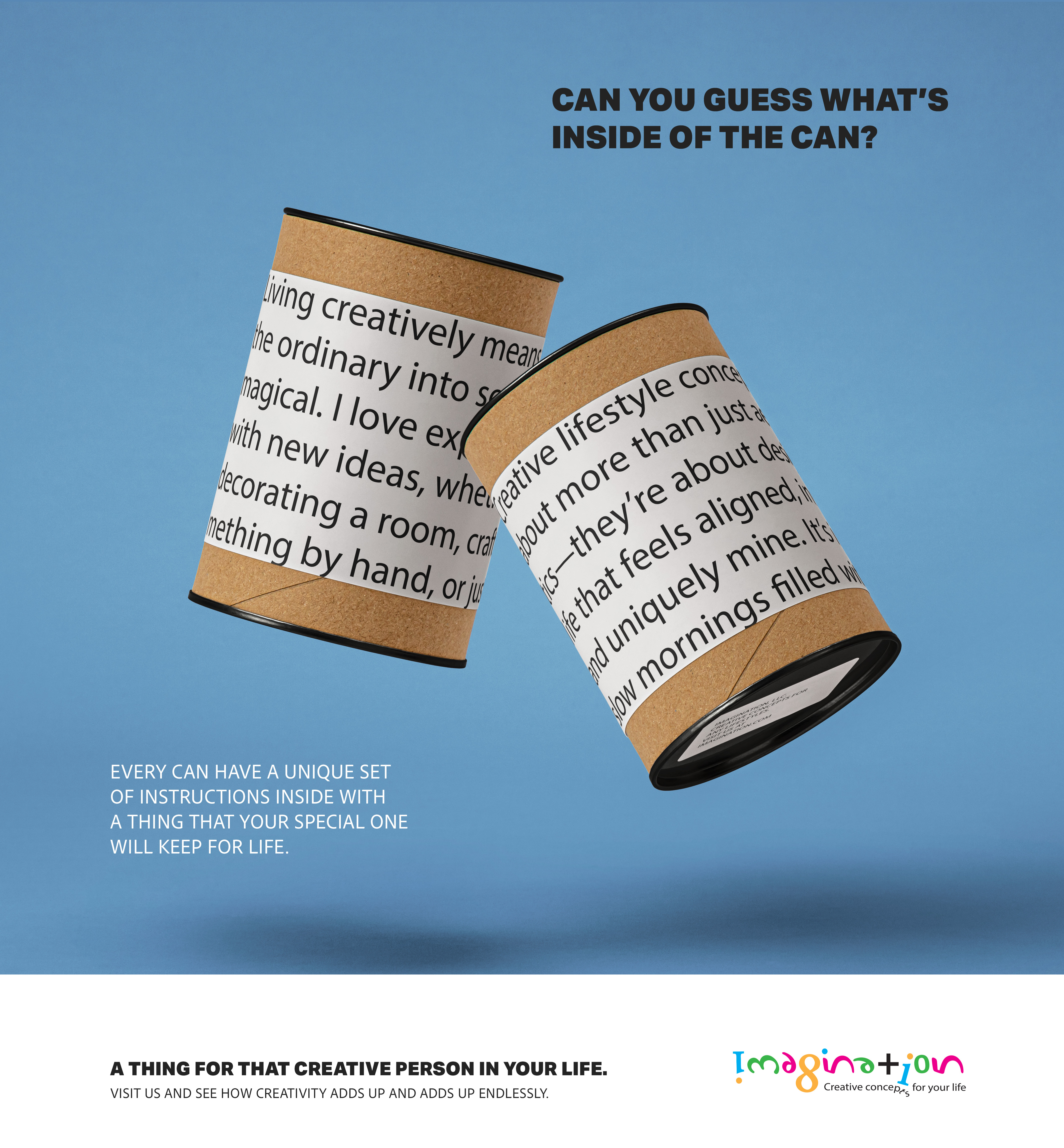
Sensory Ad Campaign
The advertising campaign focuses on the “spark” of discovery.
• Tactile Interaction: I used imagery of hands breaking through physical barriers to represent the “fuel” of creativity.
• Utility Meets Magic: Marketing assets feature everyday items—like cans or coffee mugs—reimagined as containers for “endless ideas” rather than just physical products.
Brand Scalability
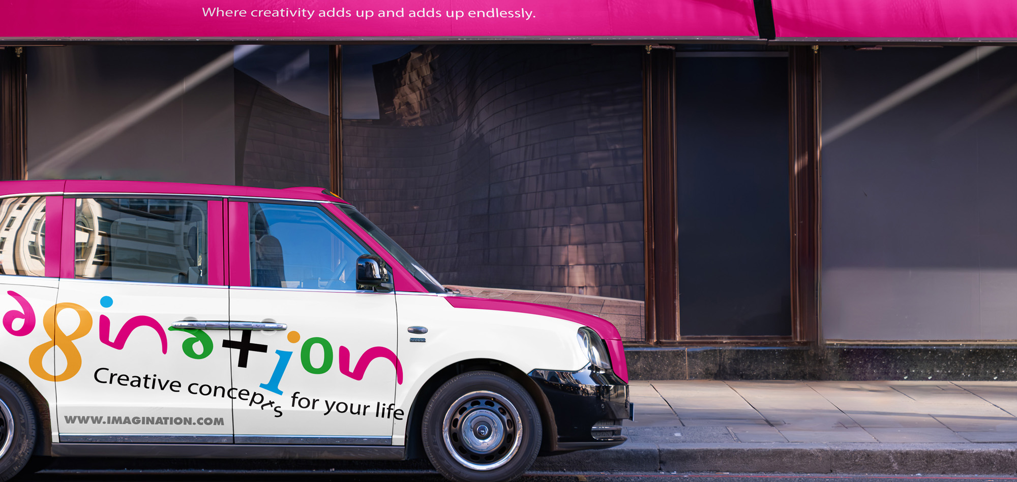
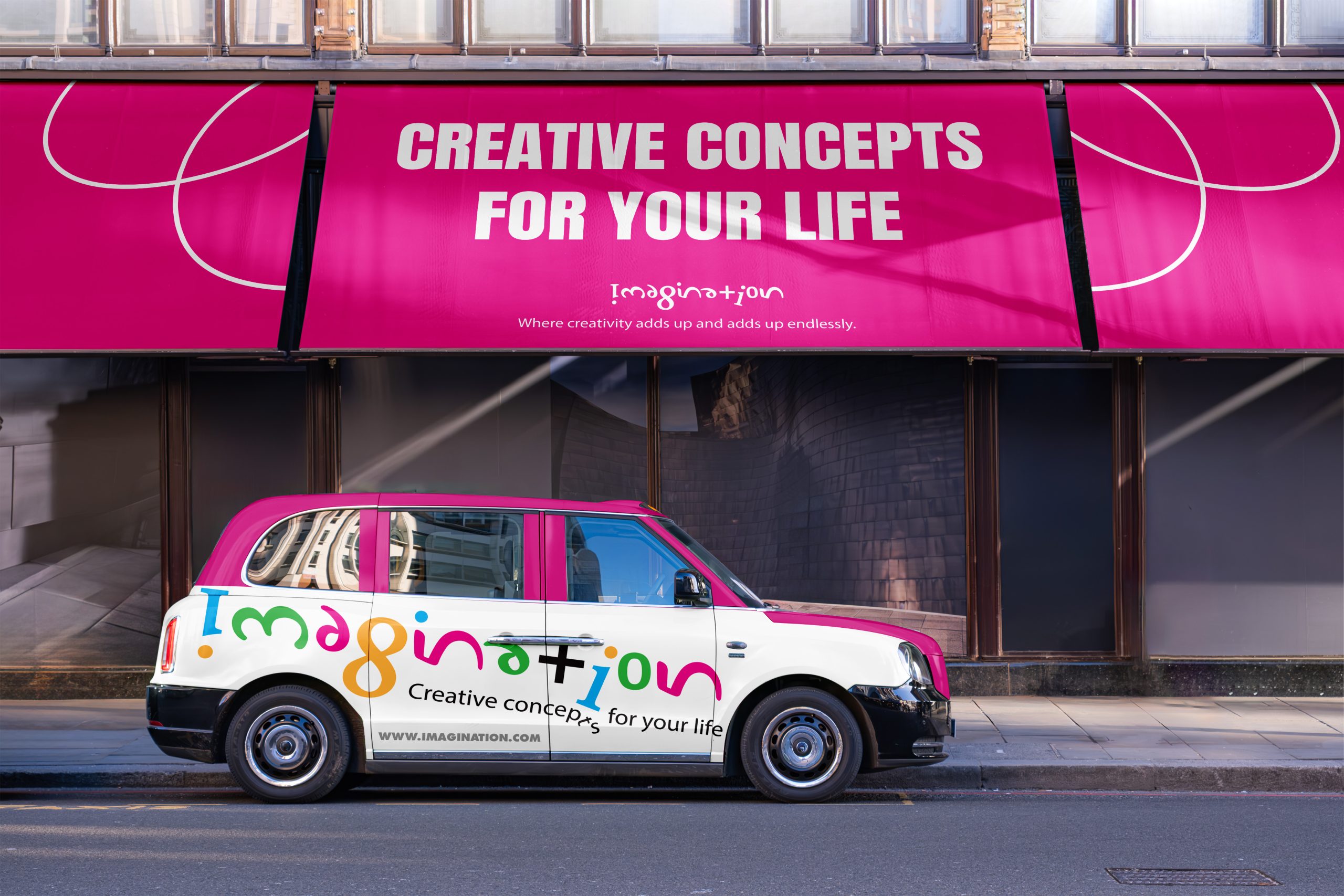
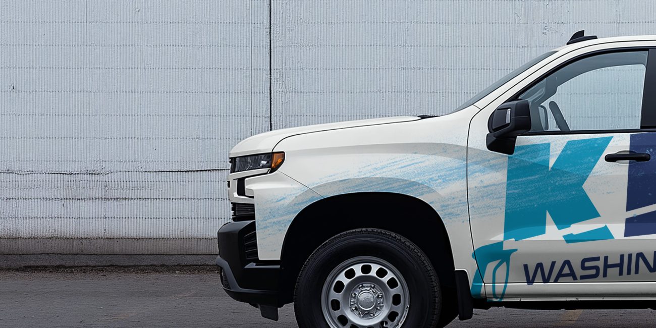
• Fleet & Environmental: The bright pink and fun color palette ensures high visibility for the “Imagination store delivery vehicle” and street-level signage.
• A Unique Identity: Created a retail name that is both a word and a mathematical statement, making it impossible to forget.
• Interactive Branding: The “coded” nature of the logo encourages customers to look closer, mirroring the store’s goal of leading people to discover things they didn’t know existed.
• Strategic Consistency: From the vehicle wrap to the store awning, the brand maintains a high-energy, “multi-step” visual language that perfectly captures the additive nature of creativity.
• Custom Naming Strategy (Alphanumeric Logic)
• Multi-Channel Print & Digital Ad Series
• Fleet Branding & Environmental Design Mockups
Selected Projects
