


FDC Evangelistic Division | Designing the Revelation Code
Brand Strategy, Logo Design, Visual Identity, Print Media
Febles Design Company (FDC) established a specialized division with a singular, high-stakes mission: to share La Verdad Presente (The Present Truth) through digital imagery and functional visual elements. I was tasked with creating a primary identity that could serve as a “wordless icon” for this complex mission, as well as a suite of promotional and everyday items that could reinforce the message in a simplified, accessible way.
My Role: Strategic Branding, Identity Design, Multi Channel Production.
La Verdad Presente is intrinsically linked to the Prophetic Message of the Three Angels found in the Book of Revelation, chapter 14, verses 6 through 12. The core challenge was to condense the weight and urgency of three separate, world-altering messages (The Eternal Gospel, The Fall of Babylon, and The Mark of the Beast) into a singular, bold, and modern mark.
The brand had to be simple, strong, and energetic—a visceral icon that could convey the idea without words—while maintaining a sense of institutional authority.
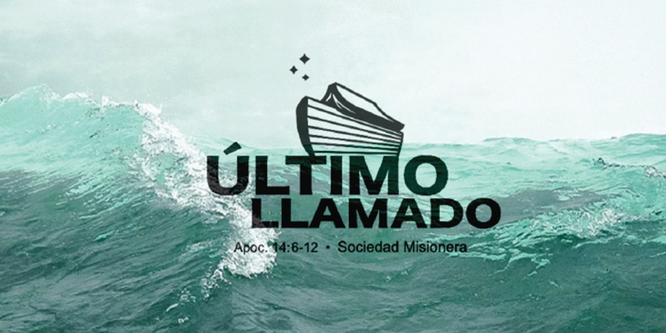
I focused on the concept of “Three Angels Flying Through the Midst of Heaven,” carrying a message to the world before the Second Coming of Christ. I developed a “Fusion Icon” that merges two seemingly opposing forms into a unified, high-contrast symbol.
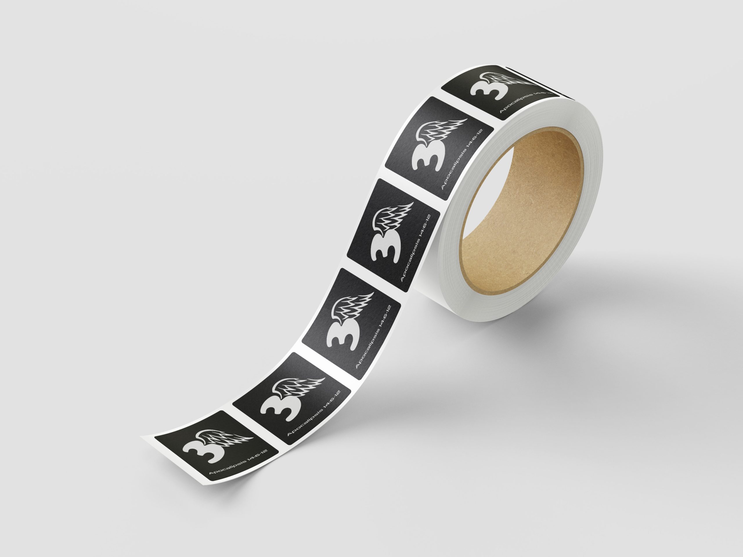
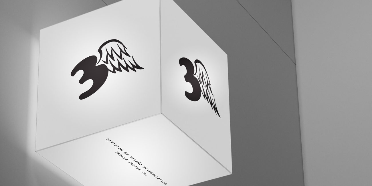
• Iconography: The number (3) serves as the anchor, representing the “threefold” nature of the prophecy. This number is merged directly with a dynamic, upward-pointing Angel Wing.
• The Fusion: By having the two elements share a single contour, they create a sense of aerodynamic flight and forward momentum. It is a modern, typographic “code” that is both reversible (black on white or white on black) and scalable for diverse physical and digital uses.
Multi-Concept Identity System
• The Core Logo: The “3 + Wing” Fusion Icon is paired with a clean, industrial wordmark: GRAFIKDESIGN. The key scriptural reference, “Apocalipsis 14:6-12”, is integrated below, anchoring the brand in its mission.
• Institutional Context: The final division name, “Division de Diseño Evangelistico, FDC”, provides the formal structure, confirming the connection to Febles Design Company.
Branding “In the Wild”
I tested the identity across multiple conceptual and functional mockups to prove its versatility:
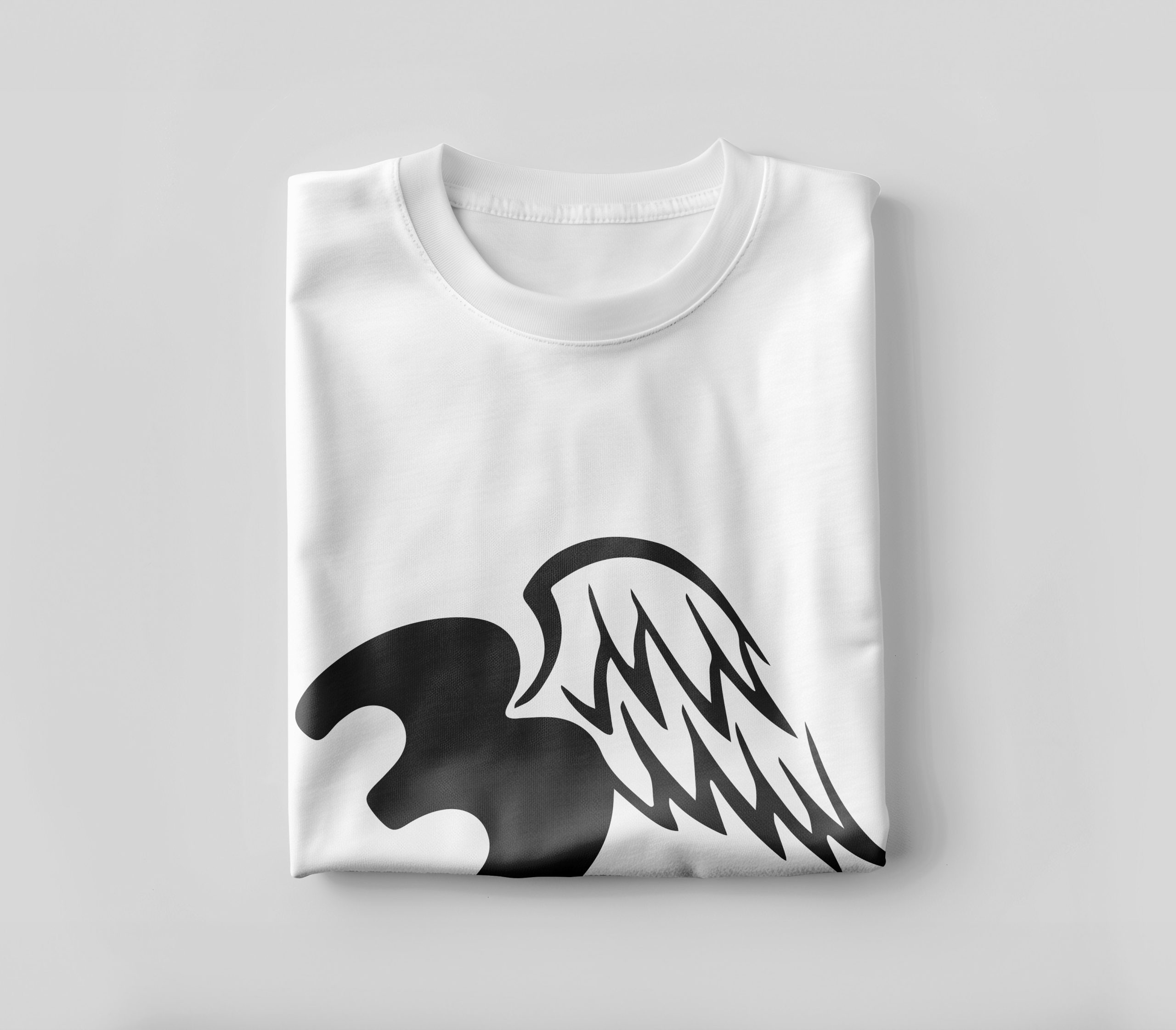
• Tactile Patterns: The application of the logo on a traditional white t-shirt and enamel mug proves its clean scalability.
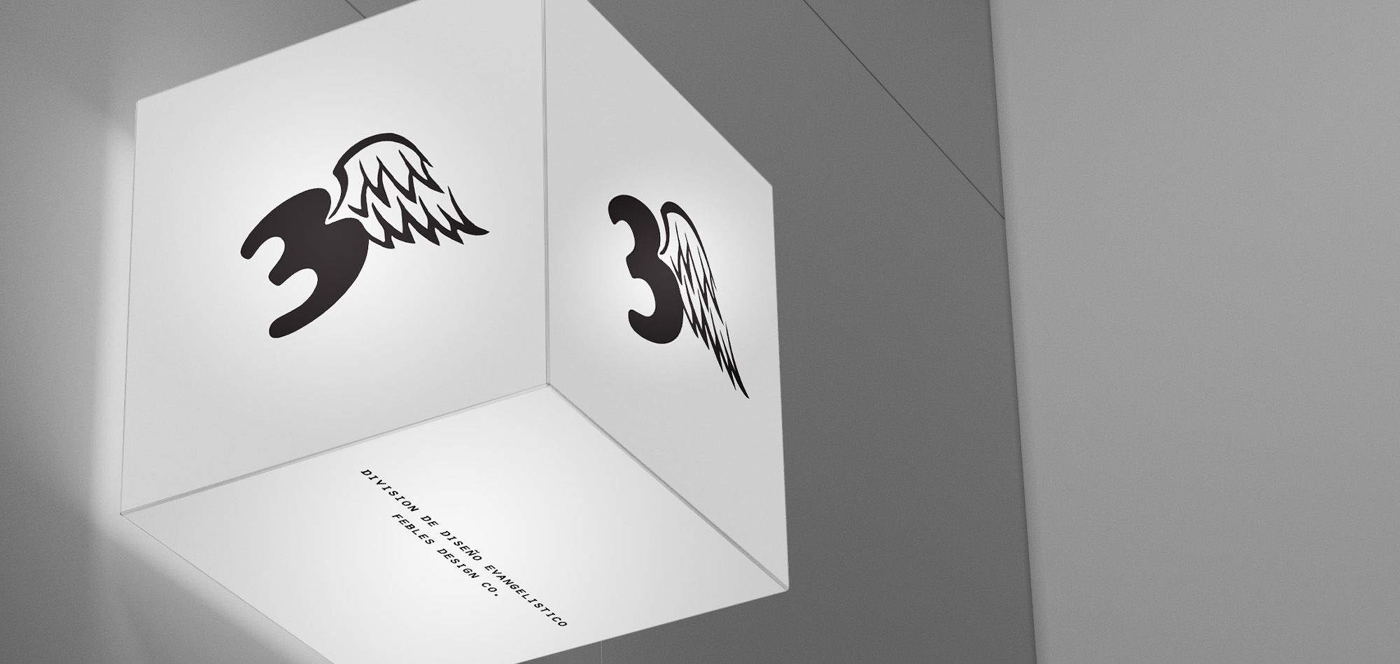
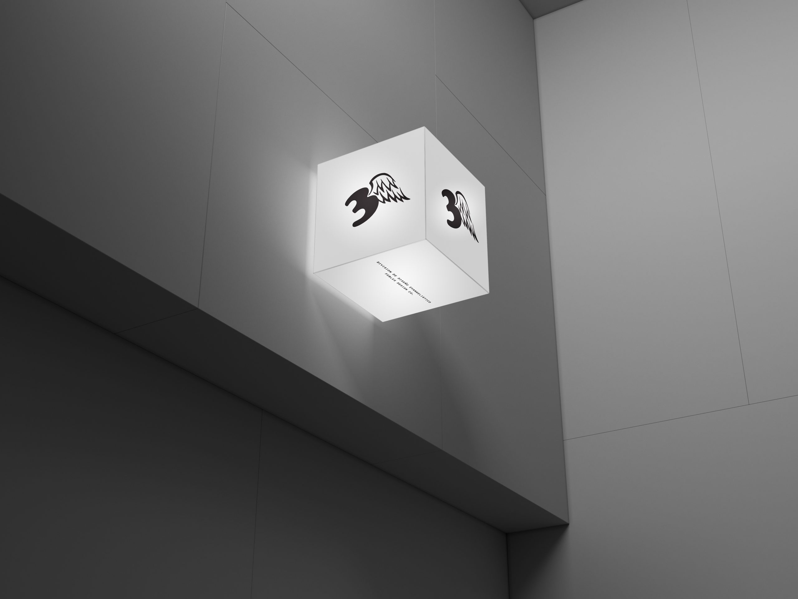
• Environmental Signage: I designed a modern, geometric light-cube sign, showing how the icon mark can command attention as a professional, illuminating installation.
• Functional Products: The brand application is extended to coordinate enamel mugs featuring the core prophecy text and a roll of heavy-duty utility tape, demonstrating how the “coded” identity can elevate even standard functional items.
Tactical Evangelism Campaign
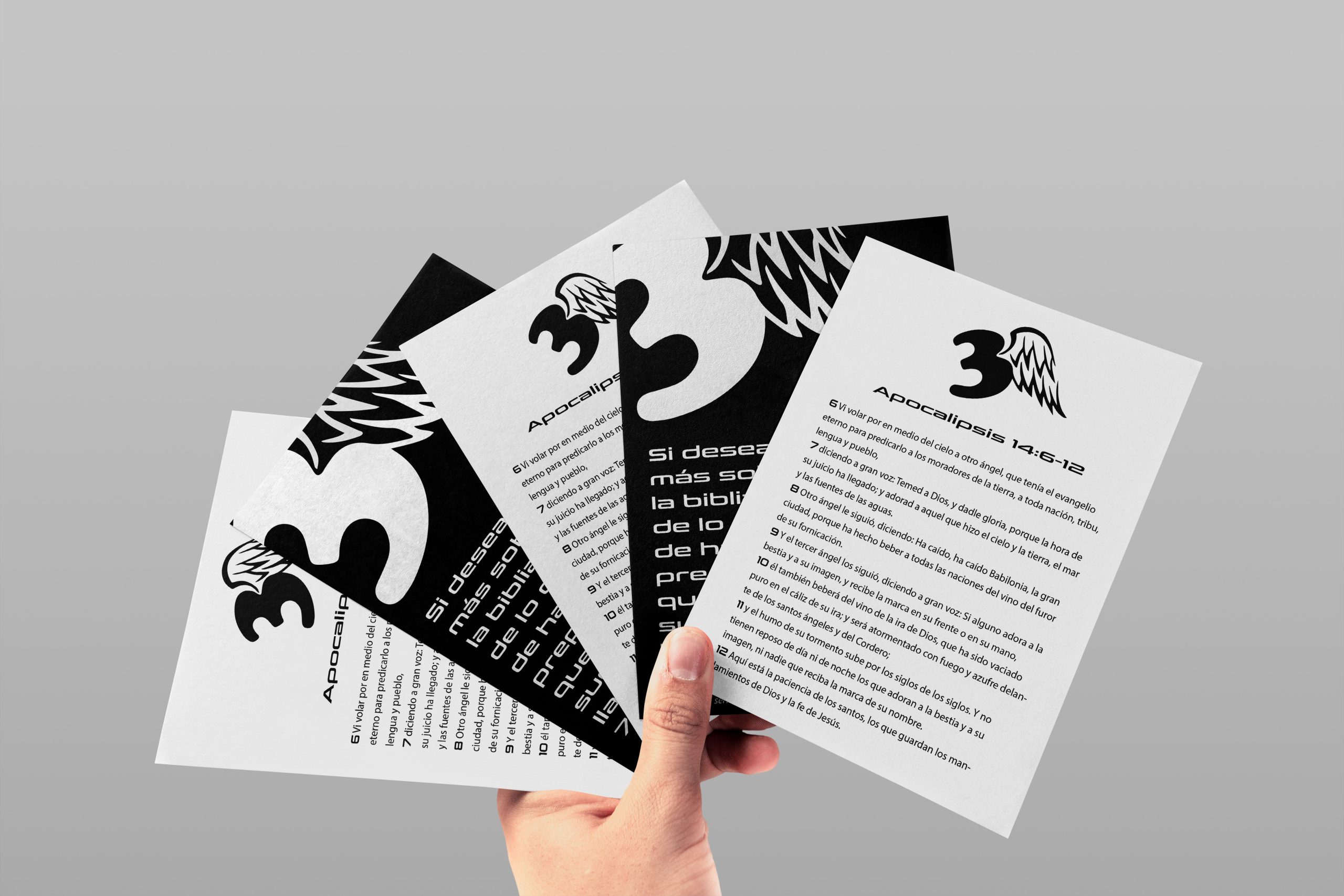
To fulfill the mission of “sharing the truth,” I developed a double sided high-contrast card:
• The Scripture side: Displays the full, multi-verse prophecy text in Spanish, directly connecting the Fusion Icon with the vital truths of the Eternal Gospel and the Fall of Babylon.
• The Call To Action side: Features the Fusion Icon on a reversed field with a bold call to action. The card emphasizes urgency: It’s serious. You need to understand what Revelation 14:6-12 says, so call to learn more about this urgent message.
• Strategic Clarity: Successfully translated complex theological prophecy into a sharp, recognizable “coded” identity that commands attention.
• Multi-Layered Message Delivery: Developed a system where the “Fusion Icon” serves as the wordless standard, while the supporting print materials deliver the detailed, urgent scriptural call to action.
• Functional Evangelism: By applying the brand to everyday utility items (mugs, tape), the project integrated the message of La Verdad Presente directly into the users’ daily lives.
• Symbolic Logo & Identity System (“3 + Wing” Fusion)
• Institutional Naming & Brand Architecture
• Multi-Platform Physical and Environmental Mockups
• Dual-Action Evangelism Print Campaign (Scripture & CTA Card)
Selected Projects
