


AF Personal Brand | The Evolution of an Identity
Logo Design, Visual Identity, Print Media
A personal brand for a designer is often the most challenging project to complete. It must serve as a signature, a seal of quality, and a versatile icon that can represent diverse ventures—from professional design documentation and client approvals to a specialized YouTube channel and a simulation-focused merchandise store.
My Role: Logo Design, Brand Strategist, Identity Design.
Early in my career, my identity was strictly analog. I used hand-drawn and scanned initials for all my professional touchpoints. As my career progressed and my online presence expanded, I realized I needed a system that could scale. The goal was to move from a “signature” to a “brand”—creating a mark that felt modern, simple, classic, and elegant.
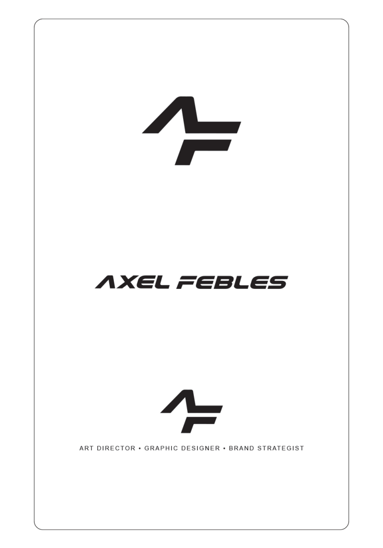
I transitioned from the organic, scanned lines of my early initials to a refined, geometric monogram designed to function as my professional seal. This choice focuses on the logo’s role as a mark of authority and authorship across all my work—serving as a definitive “signature” that validates every project I undertake.
• The Palette of Classic Elegance: To anchor this identity, I chose a strict black-and-white palette. I specifically utilized black to represent a timeless classic and elegance; it is a color that never goes out of style and provides a high-contrast foundation that doesn’t compete with the work it presents. This ensures the logo remains a sophisticated, permanent fixture of my brand, whether it’s appearing on professional design approvals, digital simulation content, or retail merchandise.
• Structural Integration [The Process of Discovery]: The logo was developed through a process of trial and error, moving through various iterations to find the perfect balance between my first and last name initials. By exploring different ways the letterforms could interact, I eventually arrived at a structural fusion where the “A” and the “F” merge into a singular, balanced form. This organic refinement resulted in a mark that feels like a professional seal—a clean, definitive signature that represents my evolution from manual sketching to digital precision.
The Transformation
The transition from “Idea to Final” was a persistent journey of exploration and trial and error. By stripping away the organic complexity of my early sketches, I focused on the essential geometry of my initials. The resulting monogram is a testament to that refinement—a minimalist design where the ‘A’ and ‘F’ are physically locked into a single structural backbone. This shared anatomy represents more than just a name; it symbolizes the seamless intersection where my personal creative identity meets professional strategic discipline.
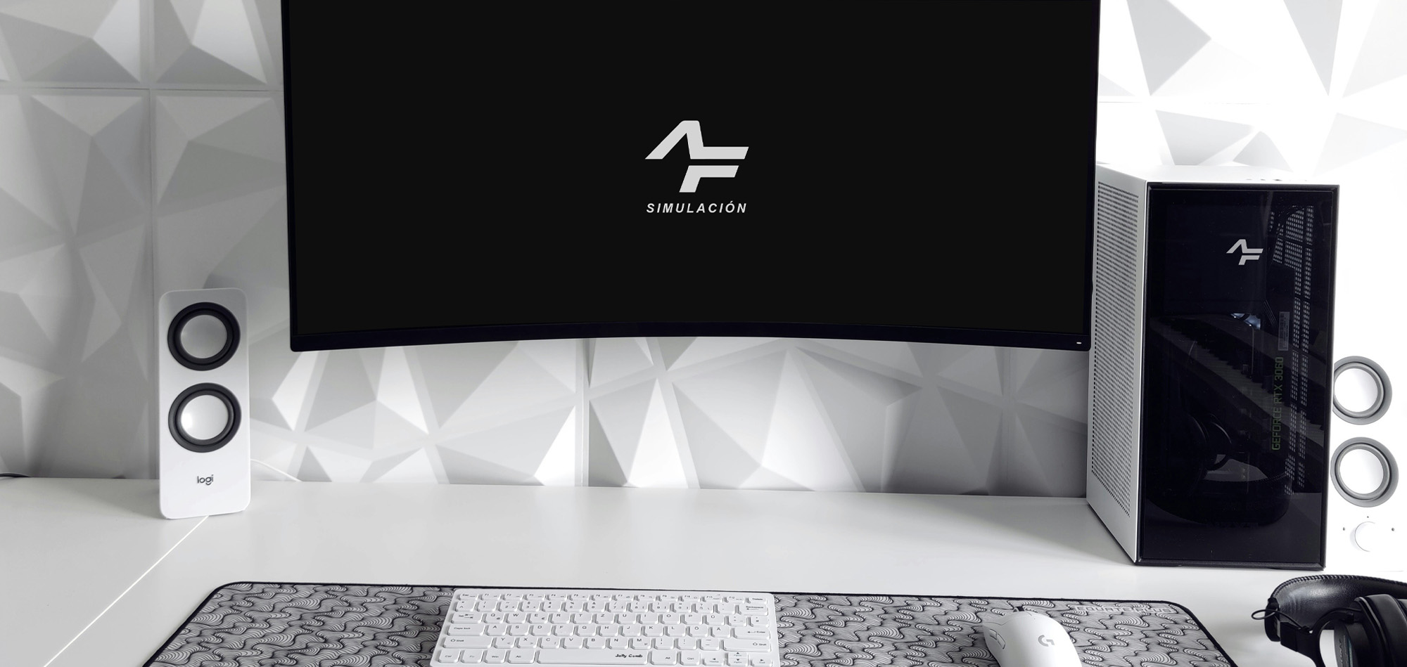
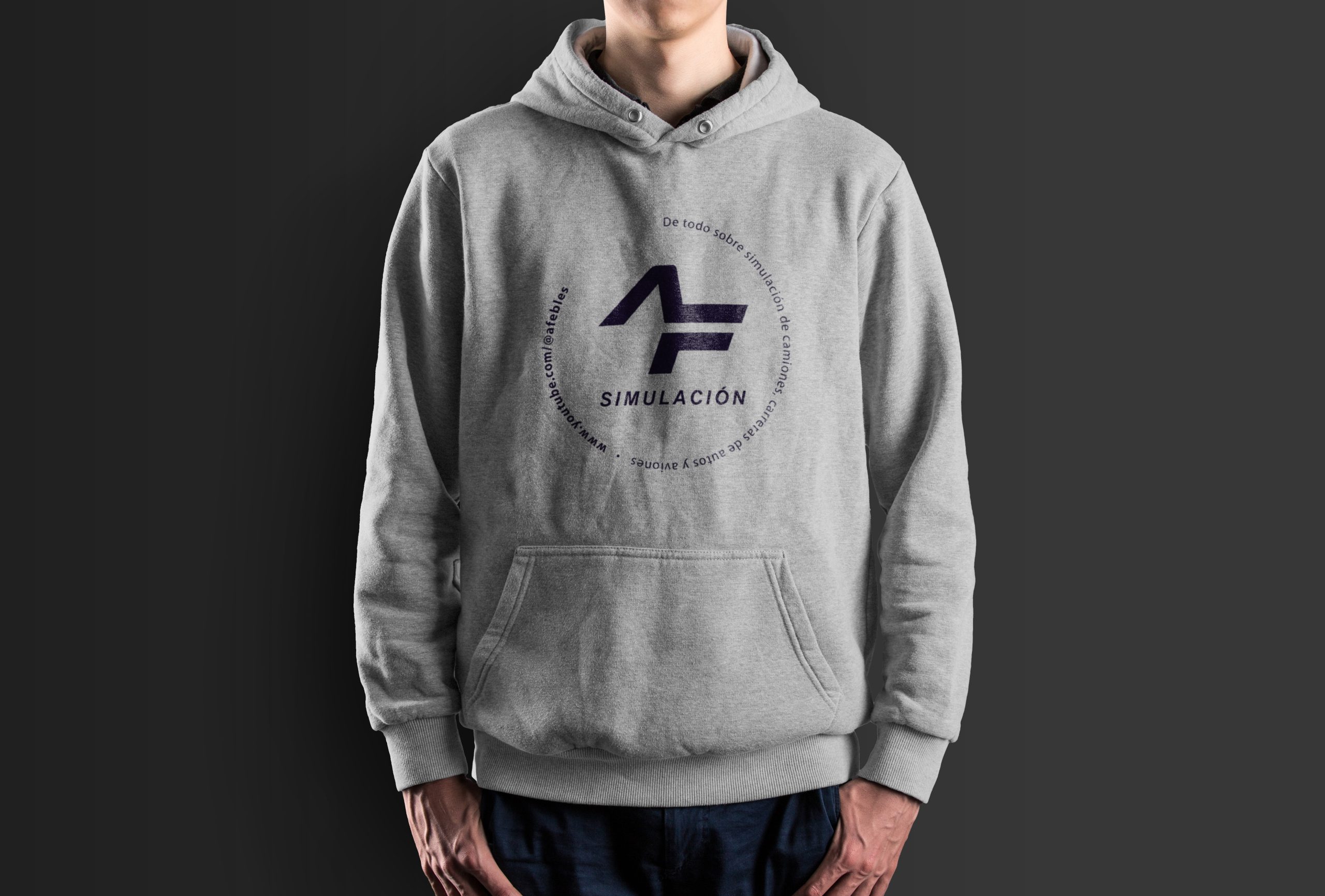
Online Presence & The Simulation World
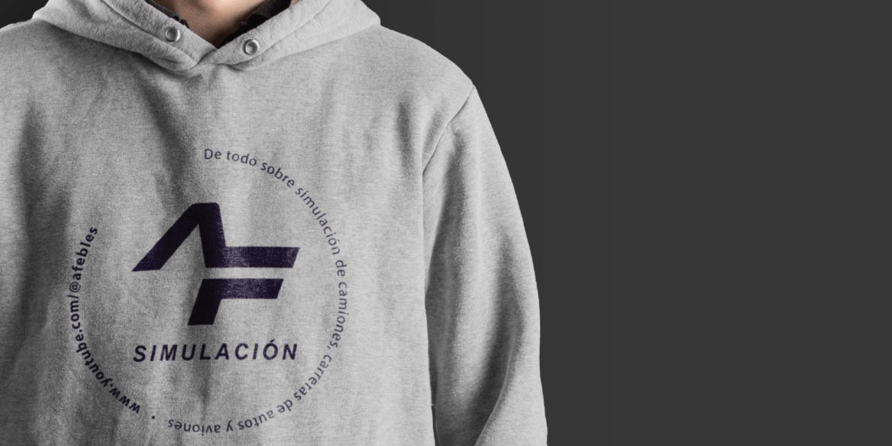
My personal branding successfully transitioned into my digital content creation visual identity mark, specifically for my YouTube channel dedicated to simulation. The AF mark was used to bridge my professional design expertise with my personal passion of flight and truck simulation, creating a unified presence across the web.
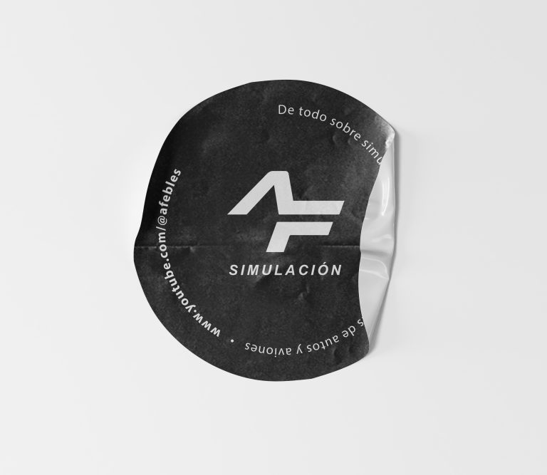
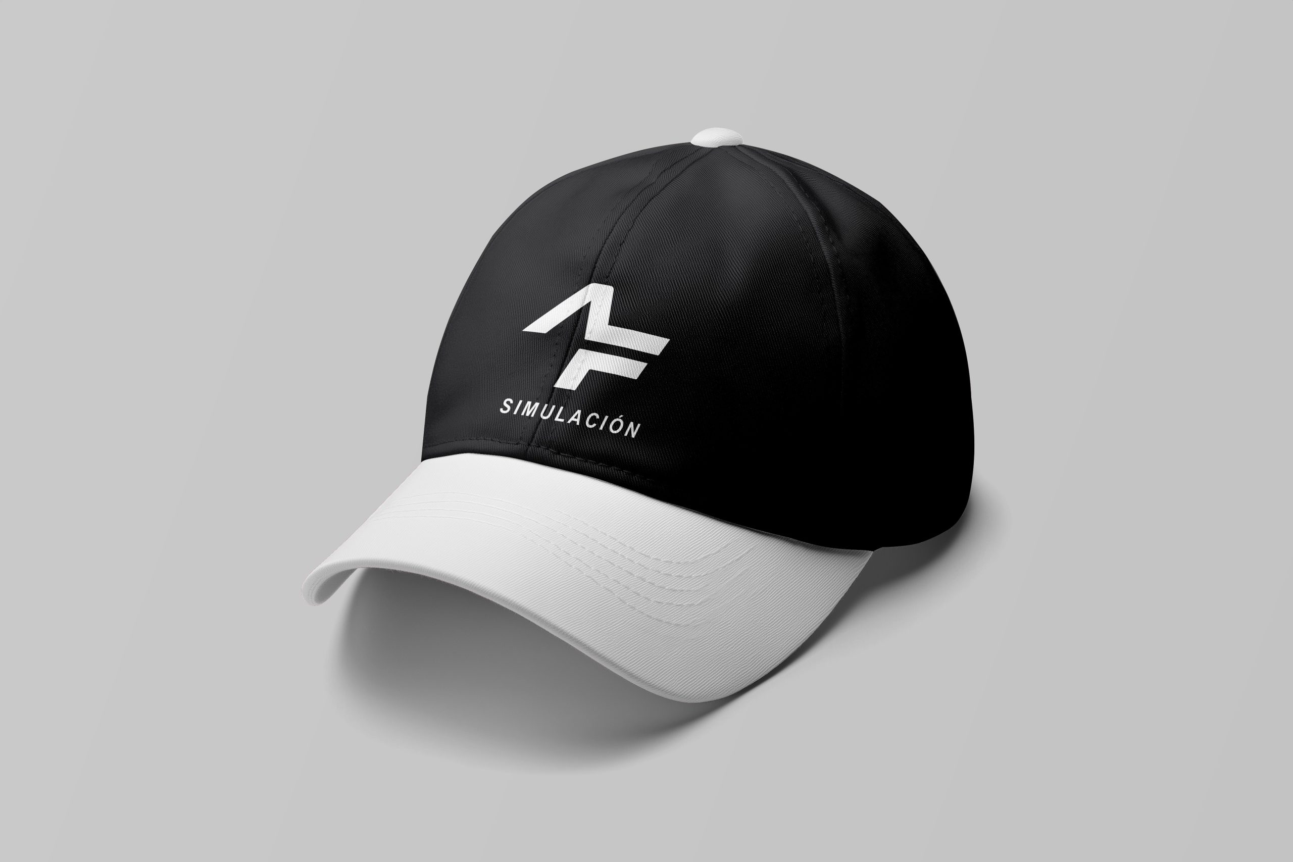
Lifestyle & Merchandise
The logo was tested across a variety of high-end lifestyle items for my online store, proving its versatility as a fashion-forward icon:
• Apparel: On premium hoodies and baseball caps, the AF monogram functions as a subtle, high-end “designer label”.
• Tactile Branding: From simple stickers to professional documentation seals, the black-and-white mark maintains its sophisticated edge across every physical touchpoint.
• Identity Continuity: Successfully created a visual bridge between years of design experience and a modern, digital-first presence.
• Strategic Simplicity: The black-and-white aesthetic allows the mark to sit comfortably alongside client work, simulation content, and retail merchandise without losing its distinct character.
• Functional Maturity: The transition from hand-drawn initials to a geometric monogram represents my own growth from a student of the craft to an established brand strategist.
• Primary Personal Monogram (AF)
• Black & White Brand Architecture
• Merchandise & Lifestyle Product Design
• YouTube Channel Visual Identity
Selected Projects
