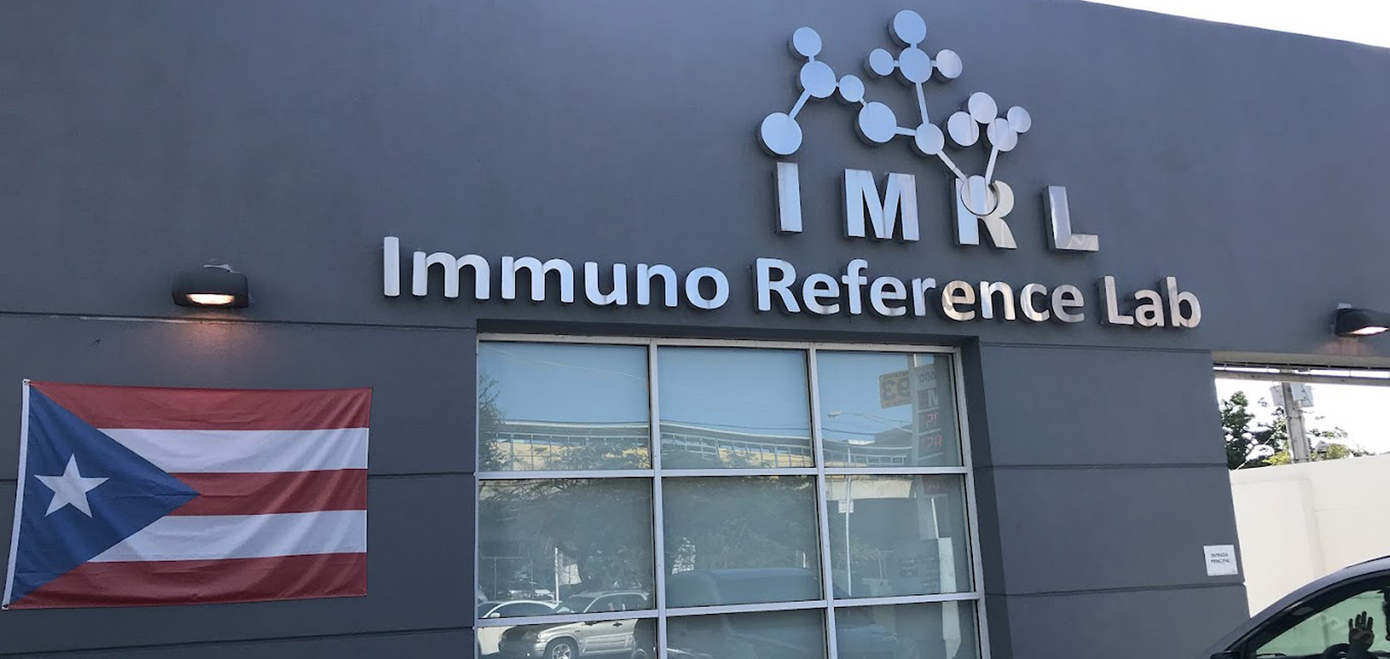


Immuno Reference Lab | Legacy of Visual Endurance
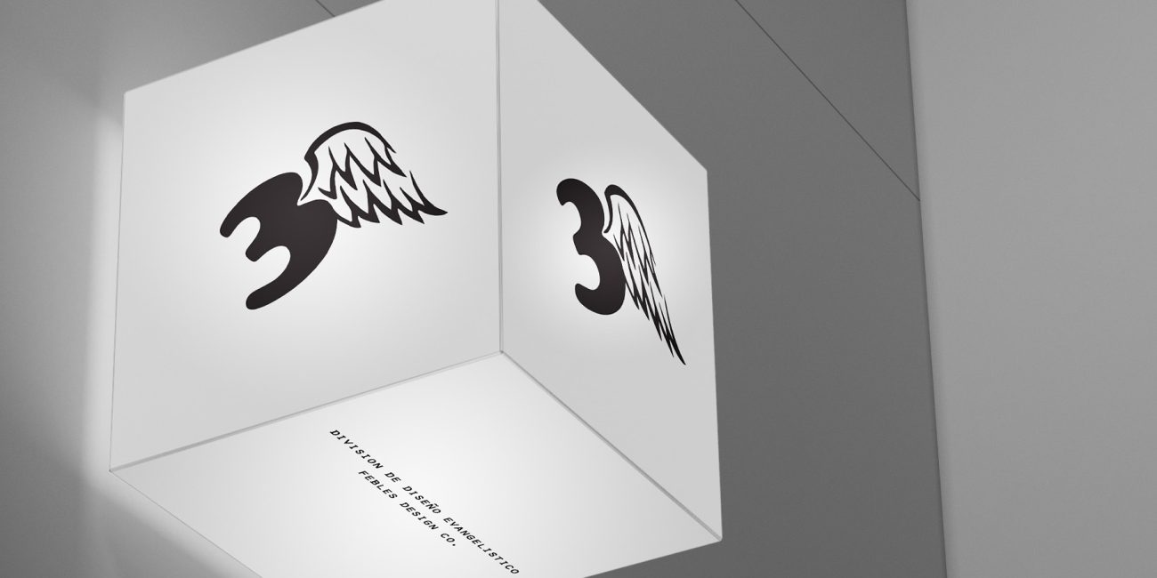
Logo Design
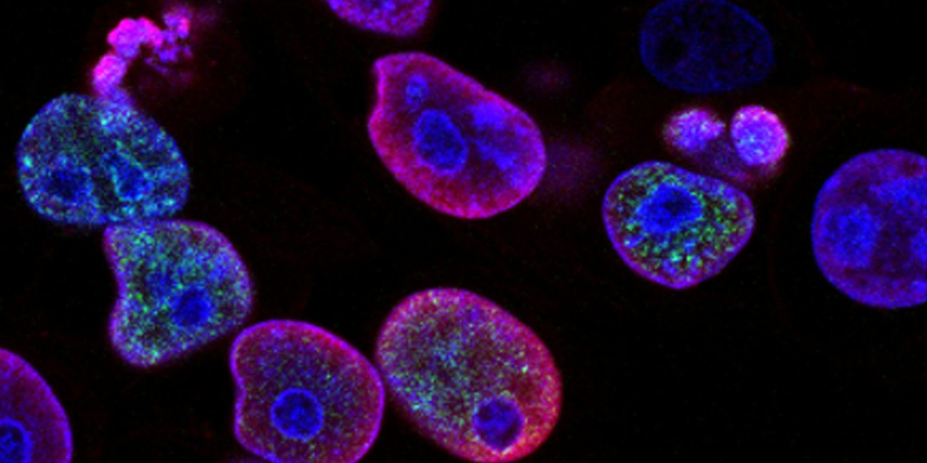
Immuno Reference Lab (IMRL) is a pioneer in the Puerto Rican healthcare sector, distinguished as the first commercial laboratory on the island to offer digital test results via the internet. Serving a massive network of over 500 clinical laboratories, 45 hospitals, and numerous diagnostic centers, IMRL is a cornerstone of the local medical infrastructure.
My Role: Logo Design (Produced in 2000)
In 2000, a group of healthcare and laboratory veterans pooled their expertise to launch a superior reference service for Puerto Rico. The challenge was to create an identity that felt technically precise, medically authoritative, and accessible. To create a logo that didn’t just look “medical,” but specifically represented this union of expertise. At the dawn of the digital results era, the brand needed to bridge the gap between traditional clinical services and the new frontier of online healthcare. The brand needed to bridge high-tech innovation with a deeply collaborative foundation.
This project holds a place of honor in my portfolio. It was one of the first professional logos I designed at the start of my career 25+ years ago. While design trends have shifted countless times since the year 2000, this identity has remained the unchanged face of IMRL for a quarter-century. Its longevity is a result of a timeless concept: The strength of a molecular bond as a metaphor for professional partnership.
• The Vision: Use scientific imagery to convey the “pooling of expertise” that defined the company’s founding.
• The Result: A symbol of stability and trust that has not required a redesign in a quarter-century.
The Symbolic Mark: The Union of Partners
The logo features an interlocking geometric icon based on molecular structures.
• The Molecular Metaphor: The central forms represent molecules, chosen specifically to convey the union of partners in their joint effort to provide world-class service.
• Structural Synergy: The way the shapes connect suggests a “Microscopic Bond”—representing how individual experts come together to form a stronger, more capable entity.
• Color Strategy: A classic medical blue reinforces the themes of trust, professionalism, and clinical precision.
Institutional Presence
• Environmental Impact: The logo’s bold, clean structure allows it to maintain authority on large-scale building exteriors and high-visibility banners.
• Scalable Precision: Designed for longevity, the mark retains its clarity whether viewed on a modern digital dashboard or a traditional printed lab report.
• Proven Equity: By maintaining the same identity since 2000, IMRL has built immense brand equity and recognition among doctors and patients throughout the island.
• Technical Resilience: The “Union” symbol remains effective and in full use today, proving that deep conceptual roots are far more durable than fleeting visual trends.
• A Legacy Standard: While many logos from the era have been redesigned or forgotten, the IMRL mark stands as a testament to the “Brand Intelligence” approach—designing assets that grow with the business rather than aging out of it.
• Original Primary Identity Design (Year 2000)
• Conceptual Strategy: Molecular Partnership Metaphor
The photos in this project were not taken by me; they belong to their respective owners. They were taken from the internet solely to illustrate the logo in use.
Selected Projects
