


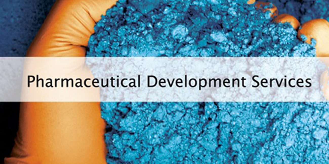

Specialty Pharma Association | Defining a Scientific Coalition
Logo Design, Visual Identity, Print Media
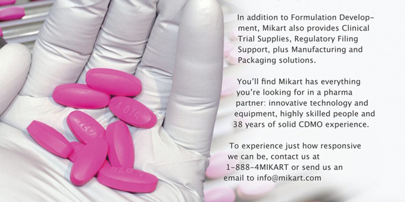
The Specialty Pharma Association is a strategic coalition of pharmaceutical manufacturers, distributors, developers, and support companies. Their mission is to provide products and services that measurably improve the lives of the patients they serve. I was tasked with developing a unified visual identity that conveys professional authority and scientific innovation.
My Role: Brand Strategy, Identity Design, Typography Architecture.
The pharmaceutical sector requires an aesthetic that balances innovation with absolute reliability. The brief called for an identity that was:
• Simple & Clean: Ensuring the mark remains recognizable across various scales.
• Professional & Institutional: Representing a diverse group of high-level industry stakeholders.
• Memorable: Creating a distinct visual shorthand for pharmaceutical research.
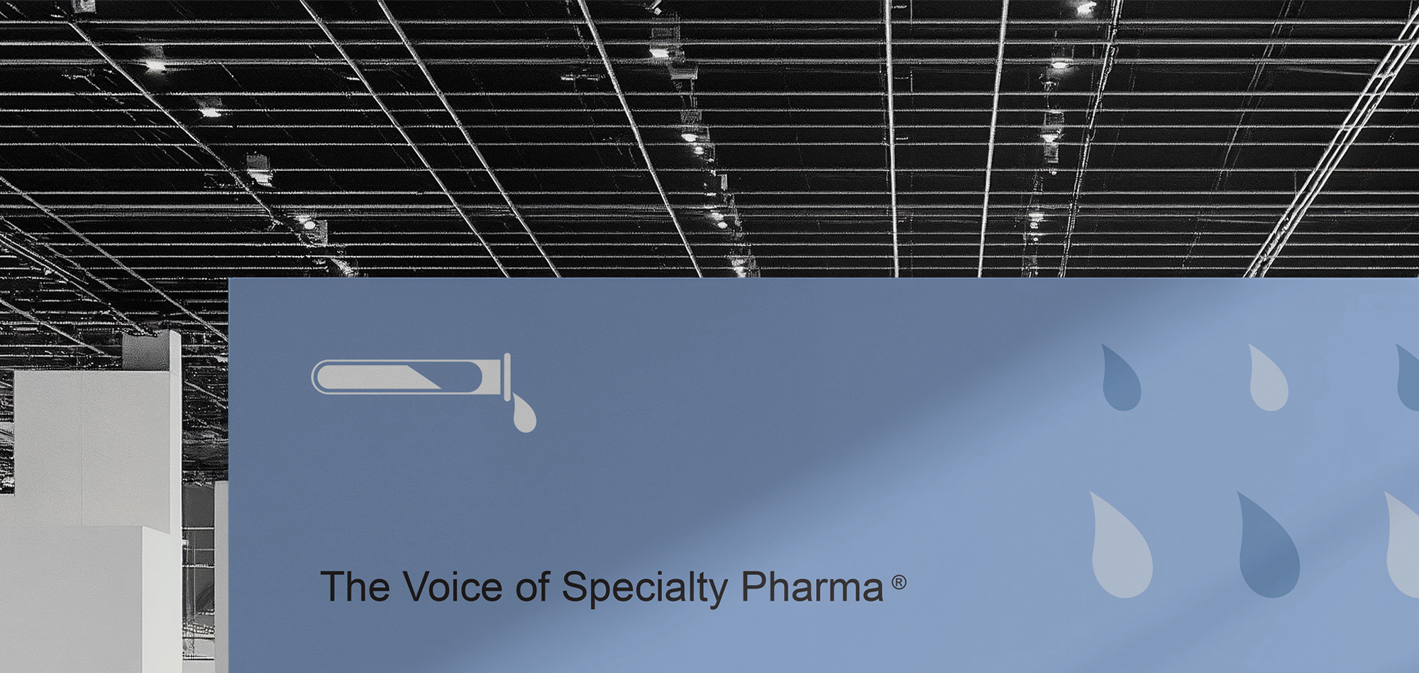
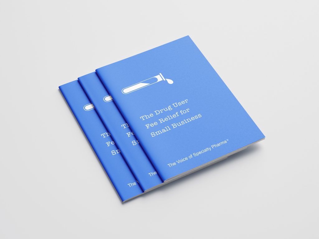
To anchor the brand in the world of science, I focused on the laboratory as the center of progress. By utilizing the test tube—the universal symbol of experimentation—the brand is immediately identifiable within its sector.
• Dynamic Innovation: The test tube is designed with blue liquid flowing into a single drop, symbolizing “active production” and the continuous flow of pharmaceutical solutions.
• Psychology of Color: A professional blue palette was selected to communicate trust, stability, and health. In application, this blue is used as a powerful flood of color on business cards and environmental graphics to reinforce brand recognition.
Iconography: The Scientific Core
The test tube serves as the primary icon, representing the experimental heart of the industry. The fluid movement of the drop adds a kinetic quality, suggesting an organization that is constantly producing results.
Typography & Brand Architecture
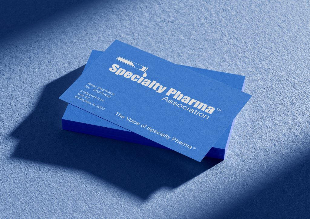
The wordmark uses a specific visual hierarchy to organize the brand’s complex name:
• “Specialty”: Rendered in a bold blue to emphasize the unique nature of the association.
• “Pharma”: Set in black to provide weight and clinical seriousness.
• “Association”: Utilizes a lighter font weight, giving the mark a formal, institutional finish without detracting from the core message.
Brand Application & Environmental Design
• Corporate Identity: On business cards, the logo is reversed in white against a deep blue background, demonstrating its versatility and high-contrast legibility.
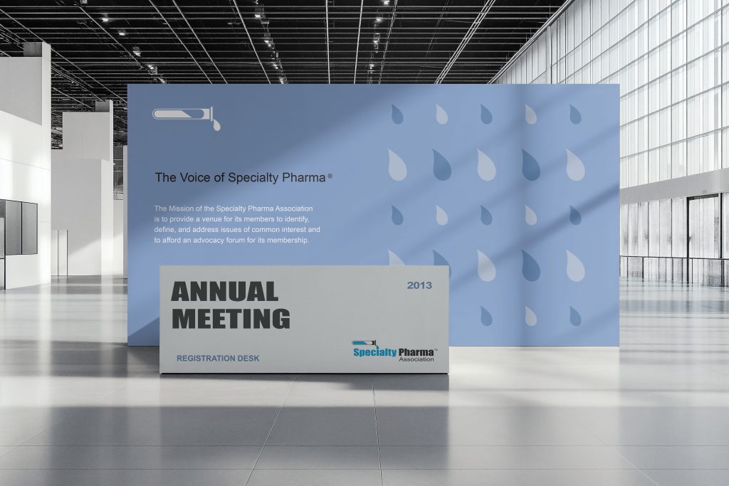
• Environmental Graphics: For registration desks and conference backdrops, the “drop” element is extracted and used as a repeating pattern, creating a sophisticated and branded physical space for the association’s annual meetings.
• Institutional Authority: Established a brand that feels like a peer to global pharmaceutical bodies.
• Strategic Versatility: The clean lines of the logo allow it to transition seamlessly from a 2-inch business card to a large-scale reception wall.
• Unified Messaging: The final identity bridges the gap between scientific experimentation (the icon) and corporate advocacy (the wordmark).
• Primary Visual Identity & Logo System
• Color Palette & Typography Standards
• Colateral Marketing Materials
• Brand Application for Corporate & Event Collateral
Selected Projects
